fpm brief

The FPM Brief, a new series of articles on consumer CPG research and behavior, highlights how research insights fuel creative intelligence in packaging design, branding, and marketing. By analyzing consumer interactions and purchasing drivers, we reveal strategies that enable brands to connect authentically with their audience, empowering them to stand out in today’s competitive market.

Read one of our latest articles

Designing Tomorrow: Navigating the Frontiers of Intelligent Design in 2024

Color Saturation and Consumer Perception of Product Sustainability

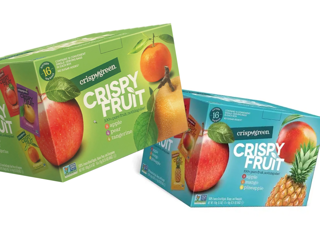
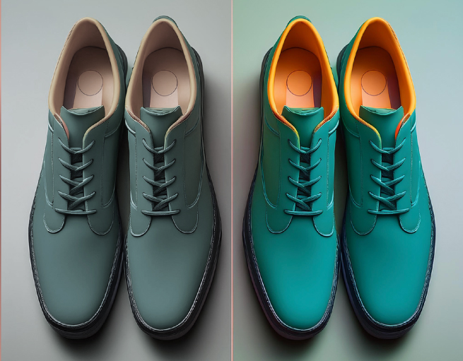
In today’s eco-conscious market, companies are leveraging color to convey sustainability messages effectively. Natural hues, particularly green, have become synonymous with eco-friendliness. However, recent research reveals that the saturation of these colors significantly impacts consumer perceptions of a product’s sustainability.
The Role of Color Saturation

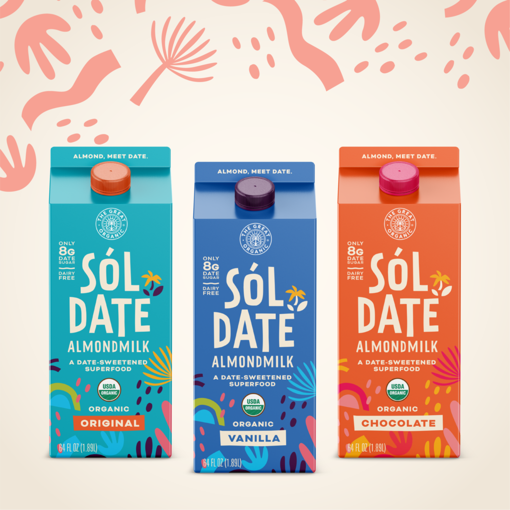
Understanding the influence of color saturation on consumer behavior and attitudes toward sustainability is crucial for businesses aiming to align their brand with eco-conscious consumer preferences. Interestingly, vibrant colors, while eye-catching, may lead consumers to perceive products as less eco-friendly. This insight challenges the conventional wisdom that brighter is always better in product design.

The Ripple Effect of Color Saturation

The research shows that the impact of color saturation extends beyond immediate perceptions. It affects the perceived naturalness of materials, the authenticity of the product, and even its durability. These factors collectively mediate the overall perception of eco-friendliness. Thus, color saturation infiltrates the core of how consumers view a product’s environmental credentials.

Building “Green Trust”

A product’s perceived eco-friendliness plays a critical role in fostering “green trust” among consumers. As sustainability becomes a priority, products adorned with low-saturation colors tend to inspire greater trust. This trust, in turn, influences consumer behavior, leading to more environmentally conscious purchasing decisions.

Strategic Use of Color in Eco-Friendly Product

These findings highlight the importance of a thoughtful approach to color use in packaging and product design. For businesses, it’s not just about choosing colors that look good but selecting those that communicate a commitment to sustainability. By using low-saturation colors, companies can enhance the perceived eco-friendliness of their products and build stronger trust with their audience.

Conclusion

The interplay between color saturation, eco-friendliness, and consumer trust underscores the dynamic relationships shaping consumer behavior in the realm of sustainable products. For businesses, this means crafting a vivid and authentic narrative of sustainability through strategic color choices. As we continue to explore the frontiers of intelligent design, these insights offer valuable guidance for creating packaging that resonates with environmentally conscious consumers and paints a picture of commitment to a greener future.

Stay tuned for more insights from Foerstel+Piper+Martin as we delve deeper into the future of intelligent design.


Credits: Exaqua for FPM
Other research you might be interested in

Augmented Reality (AR) is revolutionizing packaging design in 2024, offering consumers futuristic and immersive experiences that captivate and engage. This week, we explore how AR is transforming consumer interactions with products, particularly in the technology sector.
As we move further into the digital age, the role of packaging is expanding beyond traditional functions. The integration of IoT (Internet of Things) elements into packaging is not just an innovation; it is a fundamental shift in how we perceive and interact with products. We live in an age where packaging designs can be intelligent, sustainable, and aesthetically advanced.
In today’s rapidly evolving professional landscape, the transformative power of Artificial Intelligence (AI) is reshaping every industry. In packaging design, AI is emerging as a game-changer, enhancing creativity, optimizing workflows, and generating design variations based on consumer insights and preferences. This synergy between AI and human intelligence is setting the stage for a new era of design innovation.
Packaging design is evolving rapidly, shifting from a static form to an interactive experience. In our fast-paced, media-driven society, consumers are no longer passive recipients; they are active participants who influence and are influenced by the products they use. This paradigm shift has led to the rise of interactive packaging design, a cutting-edge approach that prioritizes user experience and fosters a reciprocal relationship between consumers and products.
In today's technologically advanced landscape, chatbots are transforming how businesses interact with their customers. These electronic conversational agents leverage natural language processing and machine learning to automate interactions, providing users with an engaging and efficient way to access corporate services.
In today's market, consumers demand more transparency and accountability from the brands they trust. Intelligent packaging, augmented with QR codes, meets this demand by providing detailed narratives about a product's journey, sourcing, authenticity, and environmental impact. This innovation turns packaging into an interactive gateway, enhancing consumer engagement and trust.
In the ever-evolving world of design, the dichotomy between minimalist and maximalist packaging design offers a fascinating contrast, much like two sides of a finely crafted coin. These distinct aesthetic approaches, though seemingly opposed, each have their own merits and ideal applications, showcasing their true potential in different contexts.
Nostalgia, that bittersweet longing for the past, has become a powerful tool in marketing, particularly in packaging design. It serves as a visual time machine, transporting consumers to earlier eras and creating immediate connections with their personal histories. Whether it’s the vibrant and psychedelic aesthetics of the 1960s or the bold, neon-soaked styles of the 1980s, retro-inspired packaging resonates deeply with consumers. For older demographics, this connection is even more poignant, allowing them to relive cherished memories from their youth.
In the realm of packaging aesthetics, a fascinating phenomenon known as white space plays a crucial role in how design elements interact with their surroundings. White space refers to the amount of empty space around a message or design element. Some packaging designs, like Apple's iconic approach, embrace generous white space to evoke simplicity and elegance. In contrast, other designs, such as Kraft's Macaroni and Cheese packaging, venture into reduced white space, creating a vibrant and visually intense tapestry where images and text closely intertwine.
The association between visual shapes and taste perceptions has long captivated sensory psychologists and packaging designers. One particularly intriguing observation is that individuals often associate curved and symmetrical shapes with sweetness, while angular and asymmetrical shapes are more commonly linked to other basic tastes such as sourness, bitterness, saltiness, and umami. This phenomenon, known as crossmodal correspondence, highlights the intricate interplay between visual and gustatory stimuli.
Graphic designers seamlessly blend images, typography, and interactive media to craft compelling messages and user experiences. But where do their ideas originate, and how do they transform them into designs? While intuition is often cited as a crucial element, the specifics of how graphic designers harness it remain somewhat mysterious.
Marketing research highlights the intricate relationship between nostalgia, consumer preferences for product shapes, and the underlying mechanism of social connectedness. Understanding how nostalgia influences these preferences is crucial for designers aiming to create appealing and effective products.

Subscribe to fpm brief

Stay connected and subscribe to our newsletter for the latest insights on today’s ever-changing CPG culture and market trends.

Book a Consultation
Tell us about yourself
Send Us A Message
Tom Foerstel : Founder & President

Tom Foerstel

Founder & President

Growing up in the San Francisco Bay Area in the 60’s, Tom developed a strong desire to create positive change for people and planet.

He went on to pursue his passion for art and design at Art Center College of Design in Pasadena, California, and worked for design firms in Southern California before moving to Boise, Idaho in the early 80’s. Foerstel Design opened its doors in 1985. Since its inception, the firm has cultivated a bold, happy, forward-looking team focussed on creating distinct and effective work on behalf of their clients.

An integral part of Tom’s philosophy is giving back to the community in which he lives — a company cornerstone that drives Foerstel’s long history of providing pro-bono services to local non-profit humanitarian and arts programs.

One of Tom’s proudest personal achievements is his ability to say Supercalifragilisticexpyalidocious backwards.