Some of our favorite design inspiration comes from simply wandering around a new city.
A good package has a way of catching you off guard. A great color combination, a type treatment you didn’t expect, or an illustration that makes you smile. The kind of thing that makes you stop mid-shop and think, okay, I need a photo of this.
We’ve been collecting a few favorites from our recent travels. Here’s what’s caught our eye lately.
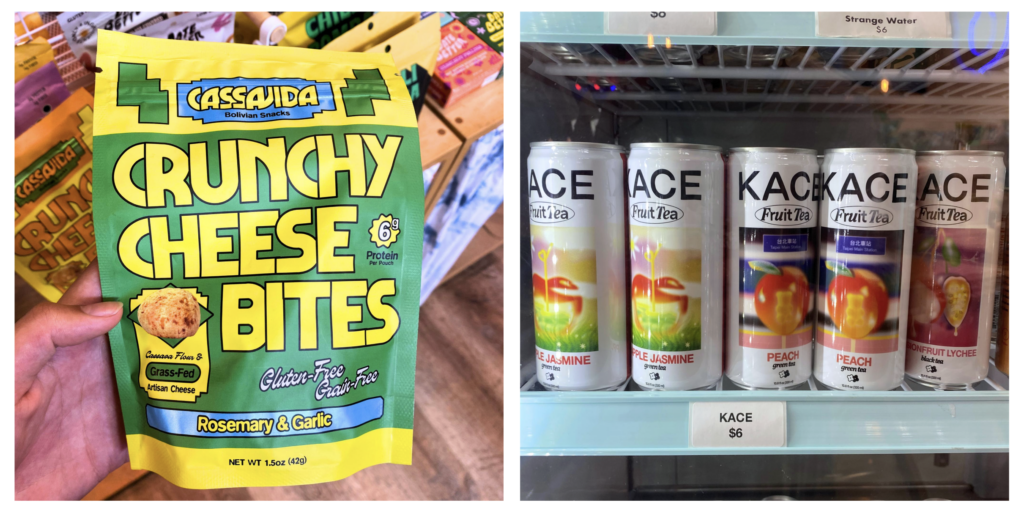
01. fearless color
We’re drawn to packaging that isn’t afraid of a little visual volume.
Unexpected color combinations. Saturated hues. Playful palettes that somehow feel both nostalgic and completely fresh.
There’s something wonderfully confident about a package that says, yes, we meant to use that much yellow.

02. typography
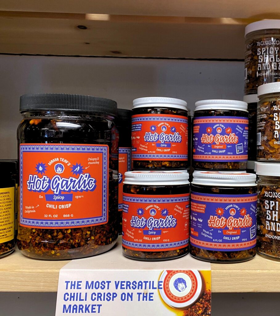
We’re especially into typography that feels expressive rather than purely functional.
Big type. Wiggly type. Unexpected combinations. Letters that become part of the illustration instead of simply labeling it.
When typography has this much personality, you don’t just read the package, you recognize it from across the room.

03. illustration
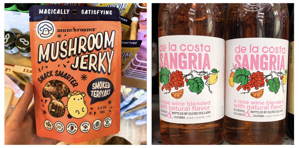
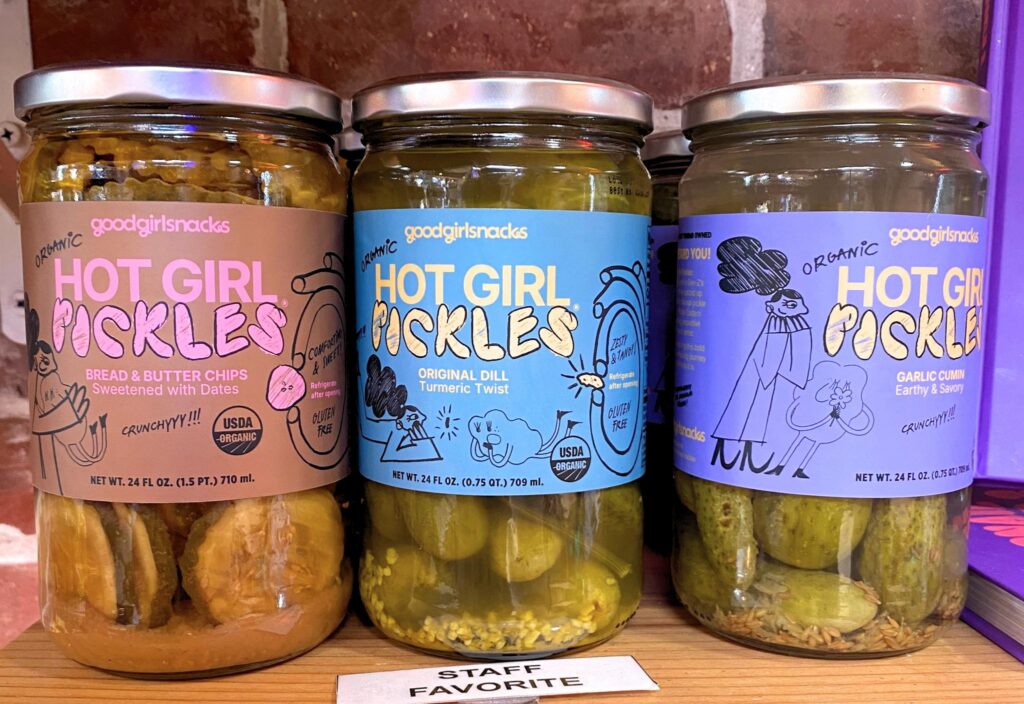
Illustration is having a moment, and we’re here for it.
Loose lines, charming characters, strange little details, hand-drawn marks, all the things that make a package feel human.
The most memorable illustrations don’t always explain the product. Sometimes they simply create a world around it. And honestly, that can be even more powerful.


loving it all?
If you’re loving what you’re seeing and craving more, please click the link below to book a 30 minute consultation with our branding and marketing experts.
until next time,