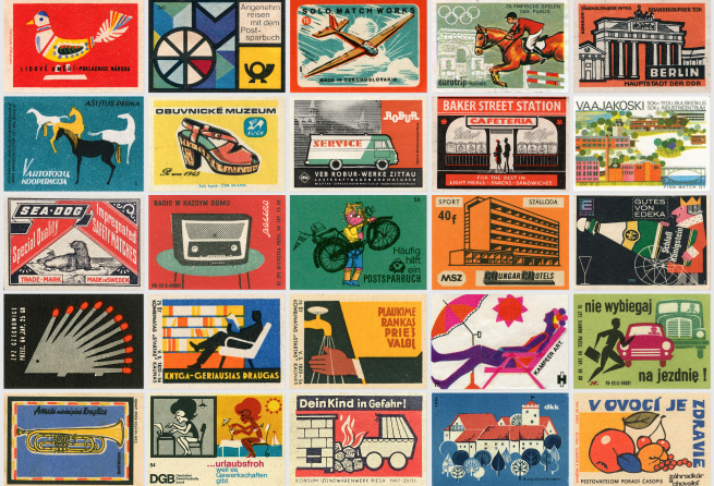
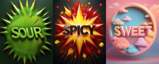
In the realm of packaging aesthetics, a fascinating phenomenon known as white space plays a crucial role in how design elements interact with their surroundings. White space refers to the amount of empty space around a message or design element. Some packaging designs, like Apple’s iconic approach, embrace generous white space to evoke simplicity and elegance. In contrast, other designs, such as Kraft’s Macaroni and Cheese packaging, venture into reduced white space, creating a vibrant and visually intense tapestry where images and text closely intertwine.
The Paradox of Visual Crowding
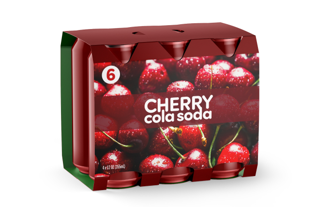
Historically, studies on visual crowding in web pages, retail spaces, and advertisements have shown that visual crowding increases visual demands on consumers, leading to psychological stress that diminishes satisfaction and purchase intent. Despite this, visually crowded packaging remains popular among consumers. This paradox raises an intriguing question: why does this preference persist?
Understanding Visual Crowding
Visual crowding refers to the psychological phenomenon where the presence of multiple similar elements in a visual field hinders the accurate identification of individual components. Recent research has explored the nuanced effects of visual crowding on consumer interaction with product packaging, revealing a delicate balance between simplicity and complexity. A key finding is the role of perceptual fluency—the ease with which visual characteristics such as complexity, clarity, contrast, and background matching are processed.
The Dual Nature of Visual Crowding
Packaging characterized by confusing visual crowding can induce psychological stress in consumers. However, when visual crowding is used strategically to enhance perceptual fluency, it can provide an information surplus that facilitates cognitive processing. This reduces mental load and allows for rapid integration and comprehension of information with minimal cognitive effort.
Strategic Use of Visual Crowding
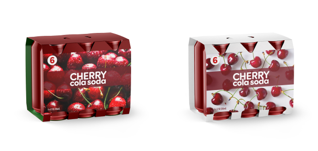
Visual crowding can be a powerful yet risky tool to support consumer choice. To effectively leverage this style, designers must balance the information provided to the consumer with an elegant and clear presentation. Mastering this balance ensures that packaging not only captures attention but also enhances the consumer’s ability to process and appreciate the information.
Conclusion
Visual crowding in packaging design represents a compelling tool that, when used skillfully, can spark consumer desire to buy. The key lies in balancing visual intensity with perceptual fluency to create an engaging and stress-free consumer experience. As we continue to explore the frontiers of intelligent design, the strategic use of visual crowding offers exciting possibilities for capturing consumer attention and driving purchase decisions.
Stay tuned for more insights from Foerstel+Piper+Martin as we delve deeper into the future of intelligent design.
Credits: Exaqua for FPM
