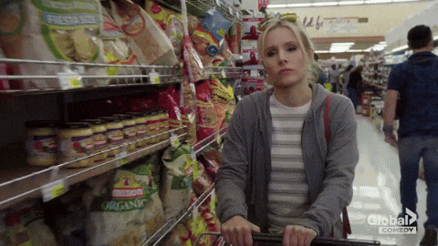
In today’s competitive retail landscape, the science behind what gets noticed and what gets purchased, extends far beyond attractive packaging. Shelf science combines elements of psychology, design, and consumer behavior to understand how shoppers make decisions in-store. From color placement to eye-level positioning, every detail is engineered to influence attention and, ultimately, drive conversion.

01. the power of eye-tracking
Eye-tracking technology delivers sharp, actionable insights into how consumers visually interact with packaging, highlighting which elements attract attention first and which are overlooked. With most purchase decisions made in just 3 to 7 seconds, brands have only a fleeting moment to capture interest on the shelf. Eye-tracking helps pinpoint whether key components like logos, product names, or callouts are being seen during that critical window. Elements such as high-contrast colors and strong visual hierarchy typically improve visibility, while cluttered or disorganized designs can cause confusion or disengagement.
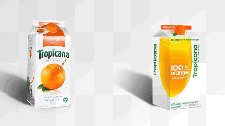
Tools like heat maps and gaze plots allow designers to optimize layouts, ensuring essential information is immediately visible and more likely to drive conversions. A striking example comes from Tropicana™: predictive eye-tracking revealed a sharp drop in logo visibility—from 15% to only 2%—meaning the brand name was virtually ignored. This visual disconnect aligned with a 20% decline in sales, leading the company to revert to its previous design. Eye-tracking technology is available now as part of FPM’s range of packaging design services.

02. how iconography drives decisions
Iconography plays a vital role in packaging design by communicating key information quickly and universally. In a retail setting where consumers often scan shelves in seconds, well-designed icons can instantly convey product features such as “organic,” “gluten-free,” or “recyclable” without the need for reading detailed text. Insights from consumer behavior studies show that shoppers are more likely to notice and trust visual symbols over lengthy descriptions, especially when making quick decisions. Additionally, consistent use of intuitive icons across a brand’s product line builds familiarity and aids recognition. When used strategically, iconography enhances shelf impact and improves usability, guiding consumers to the right choices with speed and clarity.

03. colors that convert
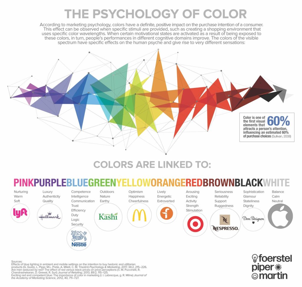
Color is one of the first things consumers notice on a package, and it plays a decisive role in shaping perception, emotion, and purchase intent. Different colors trigger specific psychological responses—red can evoke urgency or appetite, blue often conveys trust and reliability, and green is commonly associated with health and sustainability. Research shows that up to 90% of snap judgments about products can be based on color alone, especially in crowded retail environments. Effective packaging uses color to stand out, align with brand identity, and appeal to the target audience’s subconscious preferences. By leveraging color psychology, brands can better position their products, influence mood, and drive stronger emotional connections at the point of sale.

04. design backed by data
At FPM, packaging design is driven by more than aesthetics; it’s fueled by creative intelligence. By integrating insights from eye-tracking, iconography, and color psychology, FPM crafts packaging that looks good and performs on the shelf. Every design decision is backed by data and behavioral research, ensuring that key brand messages are seen, understood, and remembered in the crucial few seconds of shopper attention. From strategic layout and intuitive visuals to emotionally resonant color choices, FPM combines creativity with consumer science to deliver packaging that cuts through the noise and drives results.
let’s test your shelf-readiness.
Click the link below to take our Retail Ready quiz to see if you are prepared to hit the shelves.
