Understanding Color Psychology

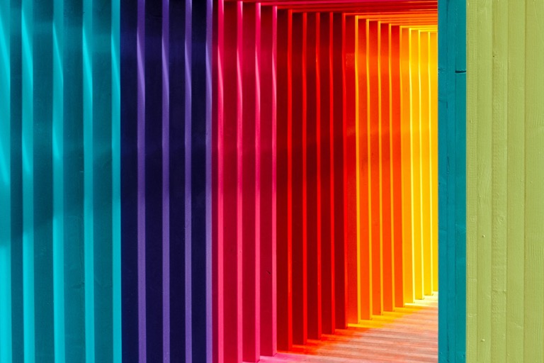
Businesses can influence consumers’ emotions through the use of color. Color psychology refers to the correlation between hues and human behavior. Designers use color as a tool to help influence their audience. Your color choice on your packaging, logo, and branding is important and will play a role in the consumer’s purchasing decisions.

Color Theory in Design

Designers implement color theory into every project. It is important o understand that color theory is not necessarily limited to set guidelines or rules, it is changing and dependent on observation and situation.

Colors are separated into three main groups:

  1. Primary
    • Red, yellow, blue
  2. Secondary
    • A mix of primary colors
  3. Tertiary
    • A combination of both, primary and secondary colors

Color in Branding

  1. Natural Association
    • Humans tend to associate colors with where they would see them in nature. Some examples include the color blue’s association with the sky, and green reminds people of foliage and trees. Humans can use color to help detect danger and feel excited from colors.
  2. Psychological or Cultural Association
    • The psychological or cultural association of color refers to how humans recognize colors based on how they were raised, or what they were exposed to. As a business, it is important to understand how your audience interprets colors. For example, in the United States, blue has masculine associations, whereas in China, it is seen as more feminine.

Tips for Using Color Effectively in Branding and Design

  1. Grasp the Basics
    • First, understand what each color in your branding palette pimples. Be sure to choose colors that appeal to your audience and correlate with your brand messaging
  2. Consider Emotions
    • Color can be used to convey a certain message and create an atmosphere and mood. Think about the emotion you hope your audience will feel when interacting with your product and design accordingly.
  3. Take Inspiration From Other Brands
    • Take a look at what your competitors are doing to ensure you are setting your brand apart. Be sure the colors you choose highlight your brand’s personality and voice.
  4. A Brand Color Palette is a Must
    • Choose a couple of colors that best represent your brand. Consider the emotions they draw from your consumers and use them across all your branding materials.
  5. Branding Means Consistency
    • Be sure to stay consistent in your branding colors. You must extend these colors to all materials being pushed out and used for your business.
  6. Apply What You Learn From Cultural and Natural Associations
    • Research the colors you want to use in your branding and understand the extent of their meaning and the associations they have with your brand.
  7. Conduct a Focus Group
    • To be sure that your audience responds to your branding colors in the way you want them to, conduct a focus group.

Read more about Color in Branding at medianews4u.com

Book a Consultation
Tell us about yourself
Send Us A Message
Tom Foerstel : Founder & President

Tom Foerstel

Founder & President

Growing up in the San Francisco Bay Area in the 60’s, Tom developed a strong desire to create positive change for people and planet.


He went on to pursue his passion for art and design at Art Center College of Design in Pasadena, California, and worked for design firms in Southern California before moving to Boise, Idaho in the early 80’s. Foerstel Design opened its doors in 1985. Since its inception, the firm has cultivated a bold, happy, forward-looking team focussed on creating distinct and effective work on behalf of their clients.


An integral part of Tom’s philosophy is giving back to the community in which he lives — a company cornerstone that drives Foerstel’s long history of providing pro-bono services to local non-profit humanitarian and arts programs.


One of Tom’s proudest personal achievements is his ability to say Supercalifragilisticexpyalidocious backwards.