
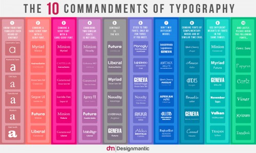

Design blog DesignMantic has created ‘The 10 Commandments of Typography’ that designers should follow/obey. Created in the form of an infographic, it lists 10 rules that one should follow when experimenting with typography.
Combining and choosing fonts is an art. Fonts do not come easy, but once you pull off the right typeface, it can make your graphics stand out and, who knows, that type may even come out as the most powerful element in your design!
Some examples include sticking with two to three fonts at most, not mixing different moods, creating contrast, and avoiding which fonts. Do you agree with these ‘10 Commandments’?
[via design taxi]