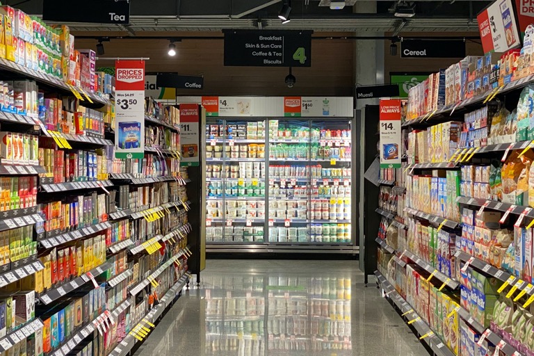
Too Many Callouts
Keep in mind that often, when designing packaging, less is more. Be sure not to crowd the front of your packaging with text. The more copy you have on the front of your packaging, the higher chance your consumer will not resonate with your messaging and walk right past your product. The front of your packaging design should catch your consumer’s eye and create a strong first impression.
Hiding The Flavor
The taste of your product is ultimately what makes your consumer repurchase your product. If your product has all the right health certifications but does not taste good, there is a high likelihood that the consumer will decide to try another product. Unfortunately, one of the most frequently made mistakes in food packaging design is that they do not highlight the taste of their product in the same way they emphasize all the positive dietary attributes.
Ignoring the Harmonization of Colors and Flavor Profiles
It is no secret that colors impact how consumers view your product and brand. Over time, consumers have created associations between certain colors and flavors. Some of these associations are attributed to the color of the natural food, while others can be credited to strong marketing. Consider matching your packaging design with the corresponding color your consumer may associate with your product. By doing this, your consumers will be able to find what they are looking for quicker, and it will help them simplify their buying decisions.
Read more about Packaging Design Mistakes at packagingdigest.com