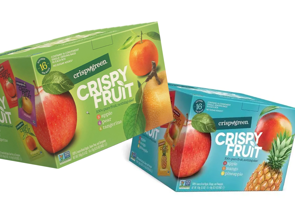
Some brands don’t need reinventing, they need revealing. Rader Farms, part of the Oregon Potato Company, has been growing premium frozen fruit in the Pacific Northwest for decades. When a brand has real heritage and real quality, packaging can ensure its story is seen rather than overlooked.
01. the challenge
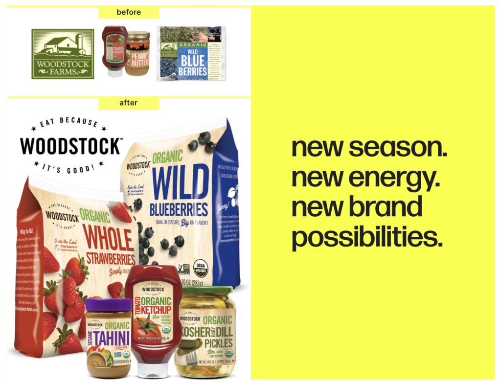
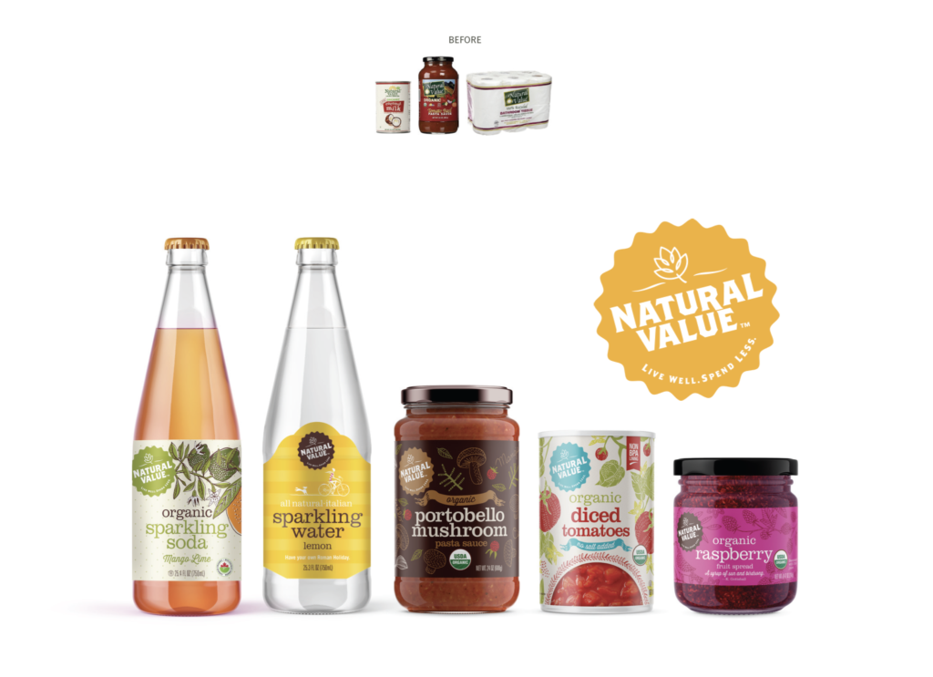
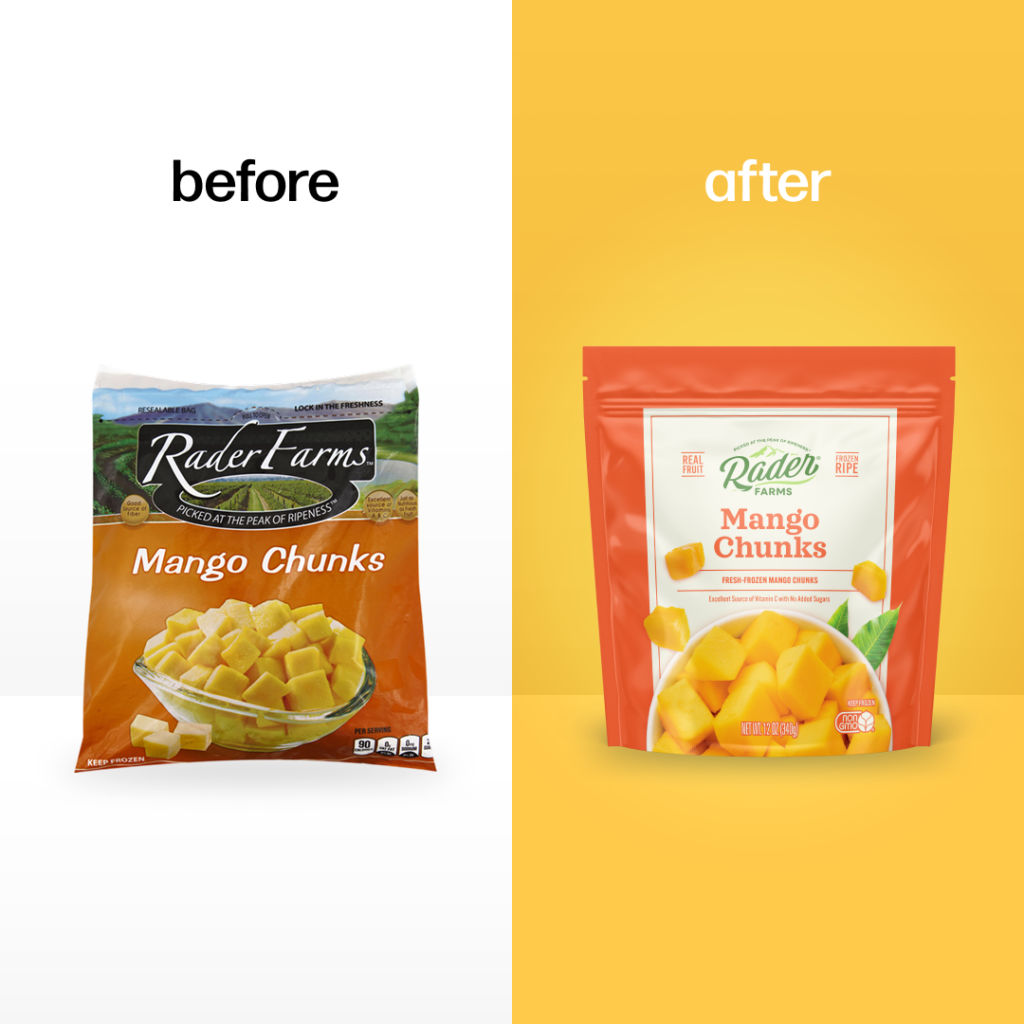
There’s a version of Rader Farms that most shoppers never really saw. Not because the product wasn’t there, but because the packaging wasn’t doing its job. Dark backgrounds, and heavy graphics. A look that blended into the frozen aisle rather than standing out from it. For a family farm with decades of real heritage and genuinely premium fruit, this was a problem worth solving.
02. the thinking
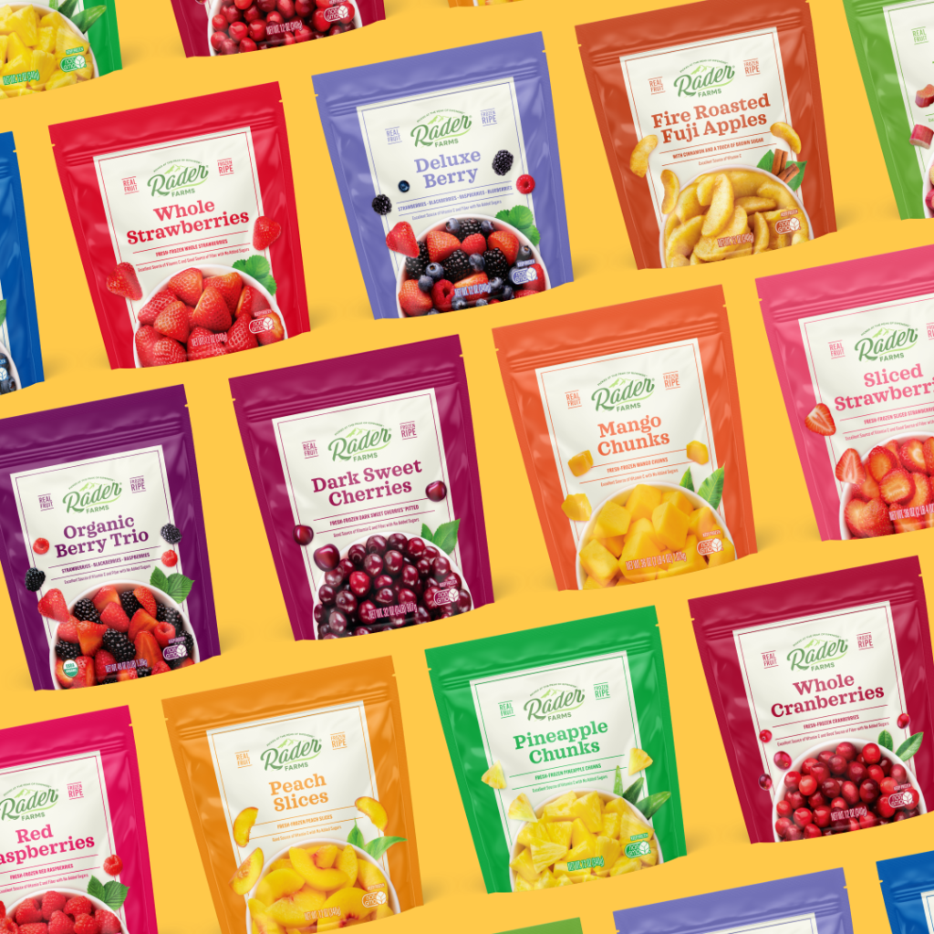
When Rader Farms came to FPM, the ask was deceptively simple: make it feel premium, but keep it approachable. Those two things can pull against each other if you’re not careful. Premium can tip into cold and distant, and approachable can slip into generic. The answer was light, literally. We moved away from the dark, heavy palette and opened the design up. Letting the fruit lead with mouthwatering images, and building a visual system that felt honest rather than manufactured.
03. the results
What followed was a full reimagining including the logo, color system, typography, and packaging architecture. The new Rader Farms doesn’t just look different on shelf, it finally looks like itself. Fresh, confident, and worth picking up.
loving what you’re seeing?
We love helping brands evolve while staying rooted in what makes them special. This project is a great example of how thoughtful design can breathe new life into established products. Click the link below to book a 30 minute consultation with our branding and marketing experts.