foerstel + piper + martin

Amafruits Sorbet and Branding

Amafruits hooked arms with Foerstel to develop packages and brand architecture that really spoke to what they sold –high-quality, healthy fruit products. It’s a competitive industry and every brand has its own style. Our creatives always push to look at the market and search out ways to help our clients stand out on the shelf, while staying recognizably part of the client’s family.

Amafruits Sorbet


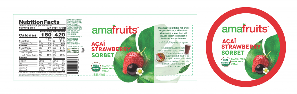
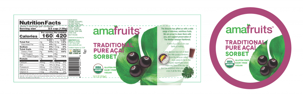
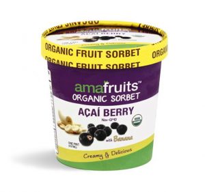
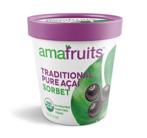
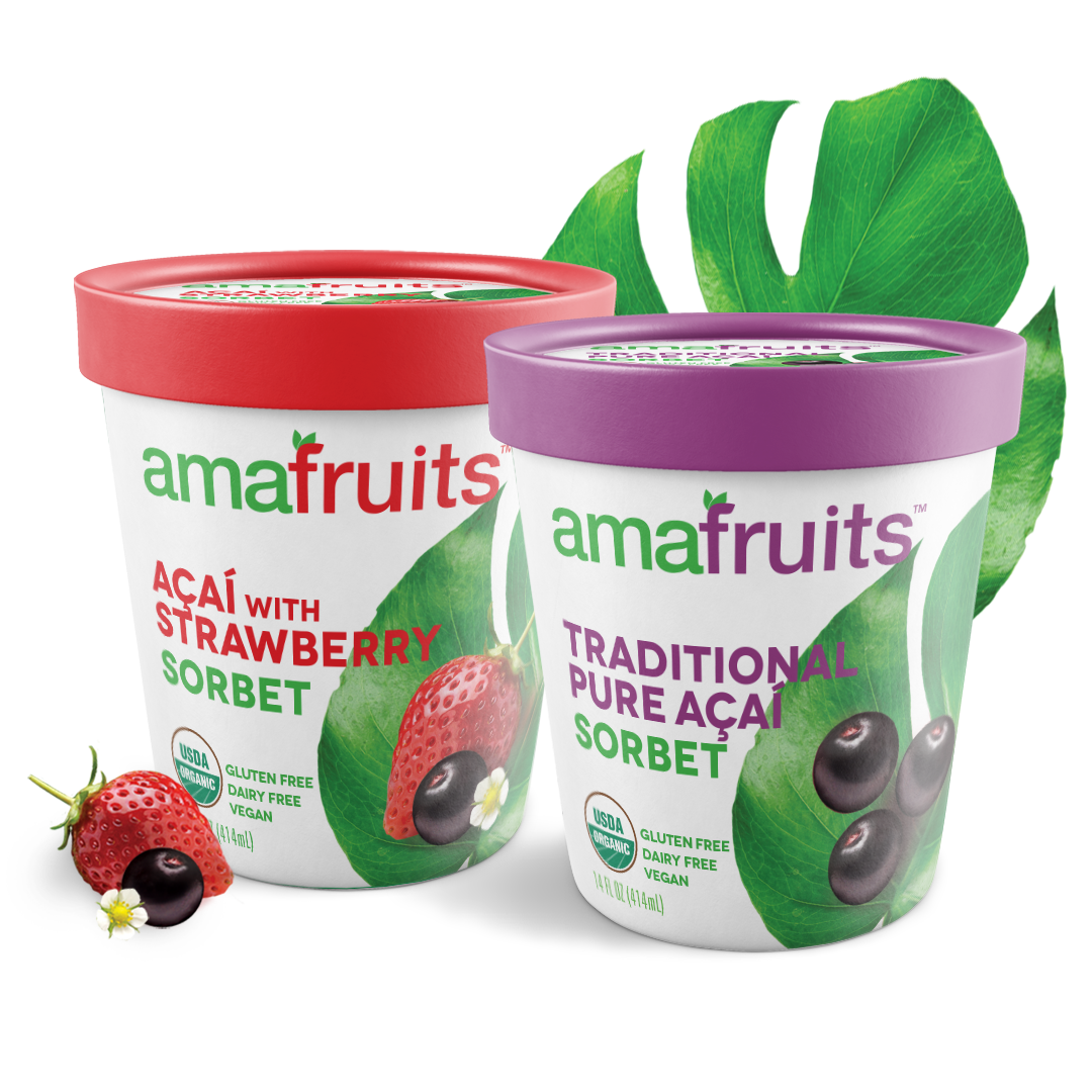
Amafruits was looking for an elegant, clean, and high-end design for their packaging


They were looking to avoid cartoony or pastel graphics, and instead aimed to communicate the richness and quality of their ingredients. It was all about the fruit. Amafruit offers the highest quality fruits on the shelf, and our concepts aimed to make sure the fruit was the hero of the design.

Working with Amafruits we moved through a number of iterations. The final printed design is clean and elegant, using an açaí leaf as a backdrop for a preview of the fresh and quality fruits and berries within. A dark, black-backed concept was in the running, but the light communicated the pure quality of the berries and helped the whole package pop off the shelf. Even when viewing the whole layout the berries are still the heroes: see for yourself!

We’re grateful to Amafruits for trusting us with their strong brand and (delicious!) sorbet, and we can’t wait to work on their next project. Take a look at the old design alongside our new one and let us know: how did we do?

Exit mobile version