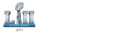
The Super Bowl is the biggest event in American sports. The 4 hour long event, has been turned in to a 7+ day media frenzy with all the major companies looking to appeal to the largest market of the year. As designers, we love seeing the event’s branding evolve from year-to-year. Shown here are a handful of Super Bowl identities, 2017/2018 logo is above.
It is very interesting to see the variety of typeface selections. Ranging from decorative, to slab serif, to sans serif–each year’s identity is specific to the site where the Super Bowl is hosted. However, in recent years it seems its stayed the same. Overall there are some wise choices, others…not so much. See for yourself.


3001
3002
3001
3004
3005
3006
3007
3008
300930103011
3012
3013
3014
3015
3016

[via sportslogos.net]

Book a Consultation
Tell us about yourself
Send Us A Message
Tom Foerstel : Founder & President

Tom Foerstel

Founder & President

Growing up in the San Francisco Bay Area in the 60’s, Tom developed a strong desire to create positive change for people and planet.


He went on to pursue his passion for art and design at Art Center College of Design in Pasadena, California, and worked for design firms in Southern California before moving to Boise, Idaho in the early 80’s. Foerstel Design opened its doors in 1985. Since its inception, the firm has cultivated a bold, happy, forward-looking team focussed on creating distinct and effective work on behalf of their clients.


An integral part of Tom’s philosophy is giving back to the community in which he lives — a company cornerstone that drives Foerstel’s long history of providing pro-bono services to local non-profit humanitarian and arts programs.


One of Tom’s proudest personal achievements is his ability to say Supercalifragilisticexpyalidocious backwards.