


Interbrand Australia’s executive creative director Chris Maclean explores the colorful history of the Trefoil, the instantly recognizable symbol for radioactivity designed by scientists at the University of California.
Words by Chris Maclean:
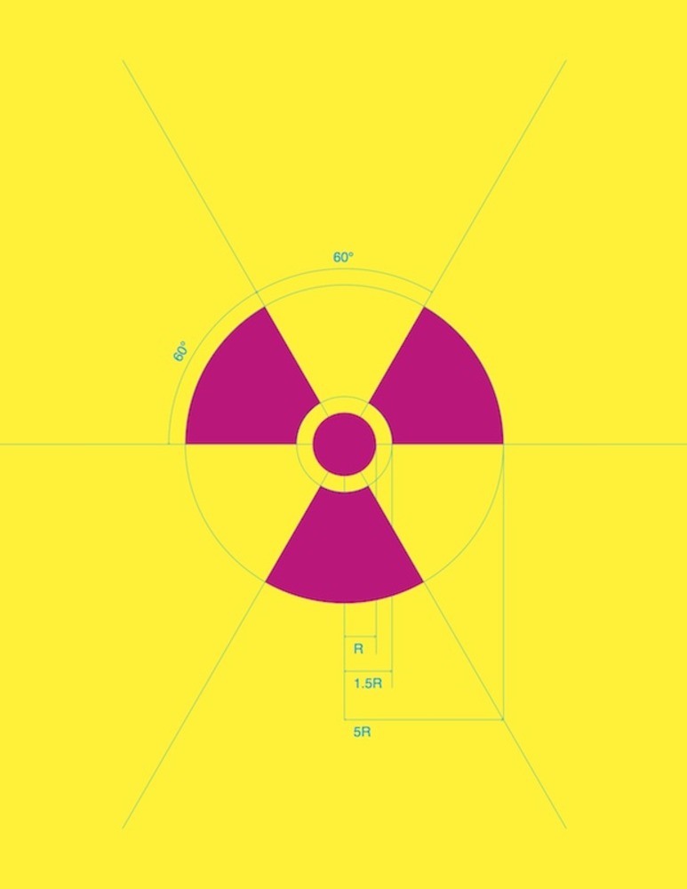
For centuries, the skull and crossbones was all that was needed to denote poisonous substances. But it wasn’t until we started experimenting with radioactive compounds that a need for further classification arose. It was in 1946, at the University of California in Berkley, that a small group of people in the Radiation Laboratory decided a new warning symbol was needed to for internal use on campus. A number of designs were doodled out, but the symbol, known as the Trefoil, was selected as the best representation of the degree of hazard and for its simplicity. The symbol represents activity radiating from an atom and is credited to Nels Garden, the then head of Health Chemistry at the Radiation Lab.
The Trefoil was originally rendered in magenta on a blue background because blue is rarely used in environments where radioactive work is carried out. Magenta was chosen because of its distinctiveness and it didn’t conflict with any other existing color codes. Garden didn’t like yellow as a background because it was too prolific on warning signs and wouldn’t stand out. But most workers felt that blue was a poor choice because of its low visibility and tendency to fade in sunlight.
The sign was further developed by another group of people at Oak Ridge Lab in 1948. A small team, lead by Bill Ray and George Warlick, experimented by cutting out the magenta trefoil and stapling it to different colored cards. From a distance of twenty feet a committee chose yellow and magenta as the best combination. This is the color scheme for the standardized Trefoil used in the USA today. The more prolific international Trefoil appears as black on a yellow background.
I find it fascinating that the Trefoil was designed by scientists, not graphic designers – it’s just so perfect. Just think about how many lives this symbol has saved. The marriage of conceptual purity, graphic simplicity, and bold color has resulted in a symbol that is instantly understood by everyone and instills utter terror on viewing. Exactly what it was designed to do.
chrismaclean.co.uk
[via grafik]