

Can you spot your country? In this amazingly fresh series, New Zealand-based artist Henry Hargreaves worked with New York-based food stylist Caitlin Levin to create gorgeous maps all made out of food. Make that real food. Originally inspired by a passion for travel, the two decided to take the food each country is most known for – spices for India, tomatoes for Italy, kiwi for New Zealand – and arrange them in a way that’s beautifully pleasant to the eye (and perhaps stomach).

“These maps show how food has traveled the globe – transforming and becoming a part of the cultural identity of that place. Who doesn’t know the saying ‘throw some shrimp on the barbie’ and not think of Australia? Who goes to France without eating bread and cheese? And who makes a Brazilian caipirinha without a fistful of limes
“These maps are a playful representation of our interpretation of food from around the world, painstakingly created with real unadulterated food. This project speaks to the universality of how food unites people, brings us together and starts conversation – just as we hope these beautiful maps will do too.” – Henry
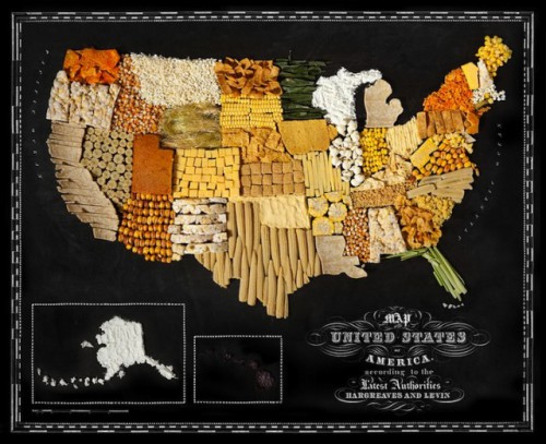
Did you notice that The United States (see above) is made out of corn? If you look closely, you’ll find that each country is predominantly made up of just one type of food. While using variations within the food type, the intriguing part is they stuck to just one type when making each map.
The typography, done by graphic designer Sarit Melmed, gives the maps a classic, vintage look. Watch how this stunning project all came together in the video, below.


Africa: bananas + plantains


India: spices


China: noodles


Australia: shrimp


France: cheese + bread


Italy: tomatoes


Japan: seaweed


New Zealand: kiwi fruit


UK + Ireland: biscuits


South America: citrus fruit

[via my modern met]