
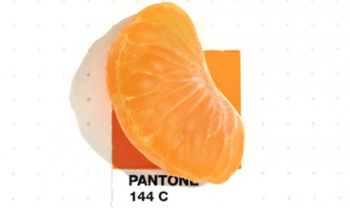

Two years ago, Inka Mathew was captivated by a vivid blue bloom in her front yard. The hue was so mesmerizing, she resolved to find out exactly what it was. A graphic designer by trade, Mathew headed straight for her Pantone chip book and found a match. She shared it with her friends, received an overwhelmingly positive response, and now has a popular blog and book deal.

“I pick objects that have meaning to me and are things that I want to remember,” Mathew says of her process. “Because of this project, I pay more attention to the details around me, especially in nature.” For example, a head from her son’s LEGO figure was a match for Pantone 116C; a seashell she found on a family vacation in Galveston, Texas, was a dead ringer for Pantone 482C. While most of the items evoke warm memories, some of them reflect the cold reality of everyday life. Her husband asked her to find a match for the cholesterol-reducing pills he was prescribed (Pantone 189C, if you’re curious).

Mathew photographs everything on an iPhone and uses Snapseed to ensure consistent exposures. She doesn’t alter the color values at all.
“The project made me more aware of the colors around me and it’s such a huge range,” she says. “Pantone is not the ‘god’ of colors and there are times I can’t find a match.” She finds matches 95% of the time, she says, and has created about 145 matches since she started.
Through her Tumblr, Mathew has connected with a diverse audience, many of whom are diagnosed with mild autism, synesthesia, and obsessive-compulsive disorder.
“They tell me that looking at the photos gives them a sense of calmness and order. It’s a cutesy, colorful thing and people can relate to it—I did not expect it to have this impact.”
Mathew’s book is expected to debut in spring 2016 with never-before-seen images. Check out the bits below and be sure to visit her Tumblr to view what she’s done so far.


