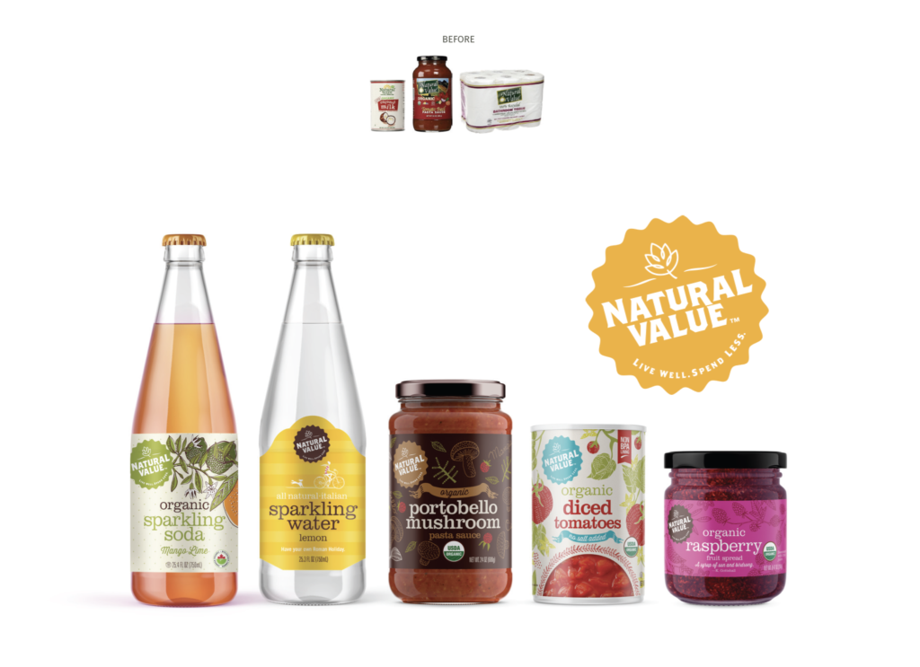
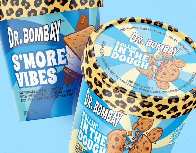
Gone are the days of soft tones and safe neutrals. Consumers are hungry for bold, joyful packaging that feels energetic, expressive, and full of life—especially on crowded shelves or social feeds.
01. color as a differentiator
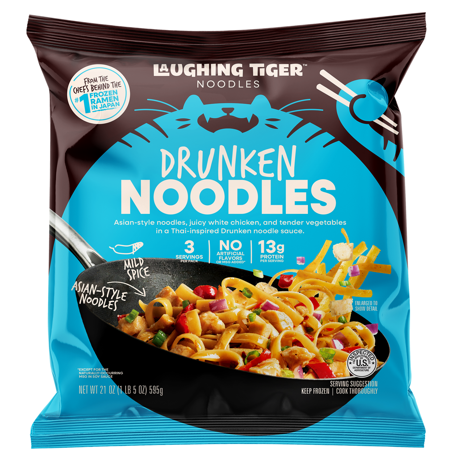
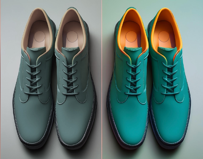
Color plays a crucial role in helping your brand stand out on crowded shelves, particularly in a saturated market. Bold, vibrant hues convey confidence, signaling to consumers that your brand is distinctive and proud of its visual identity.
02. mood-driven palettes
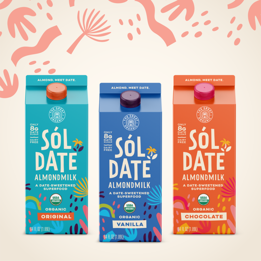
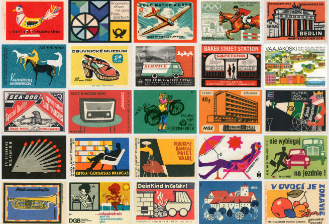
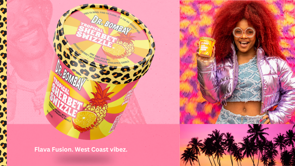
Gen Z is highly responsive to nostalgic elements inspired by the early 2000s. Incorporating bright colors and dynamic, unconventional designs such as ironic, maximalist or Y2K-inspired looks evokes a sense of childhood familiarity, fostering a strong emotional connection with the brand.
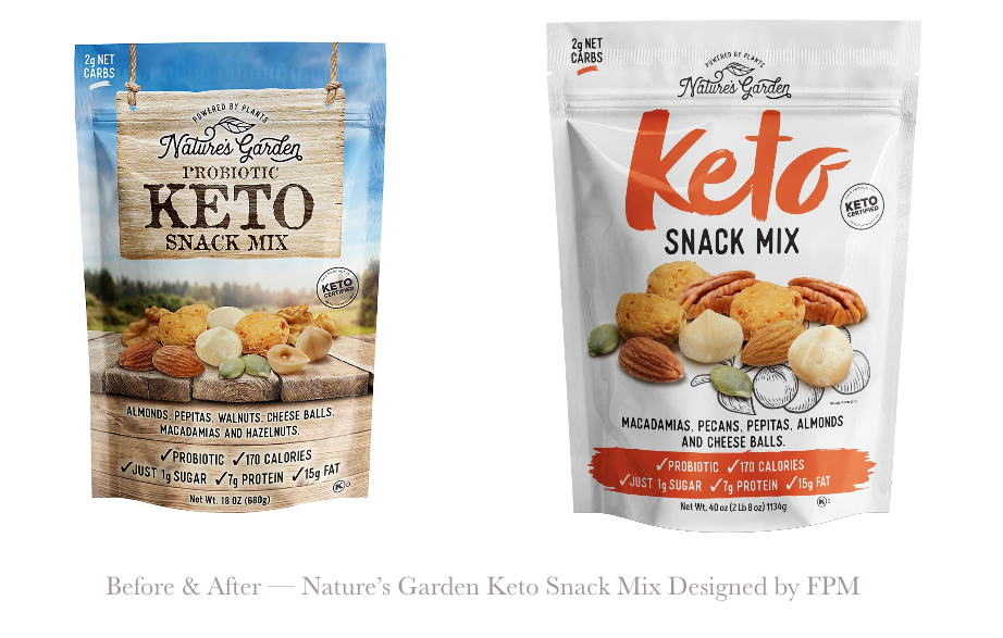
03. the “highlighter” effect
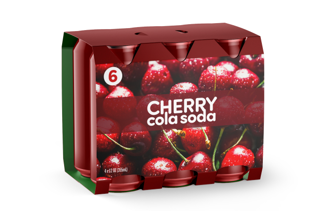
Bold primary colors offer an effective alternative to the minimalist packaging commonly seen on retail shelves. This ‘highlighter effect’ can break visual monotony, capturing attention and encouraging consumers to engage with the product.
04. accessibility win
Higher contrast and vivid hues can significantly enhance product visibility, making packaging more accessible to a diverse range of consumers, including those with visual impairments or color vision deficiencies. These design choices help ensure that branding and product information are easily noticed and understood by a broader audience.
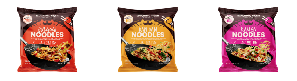
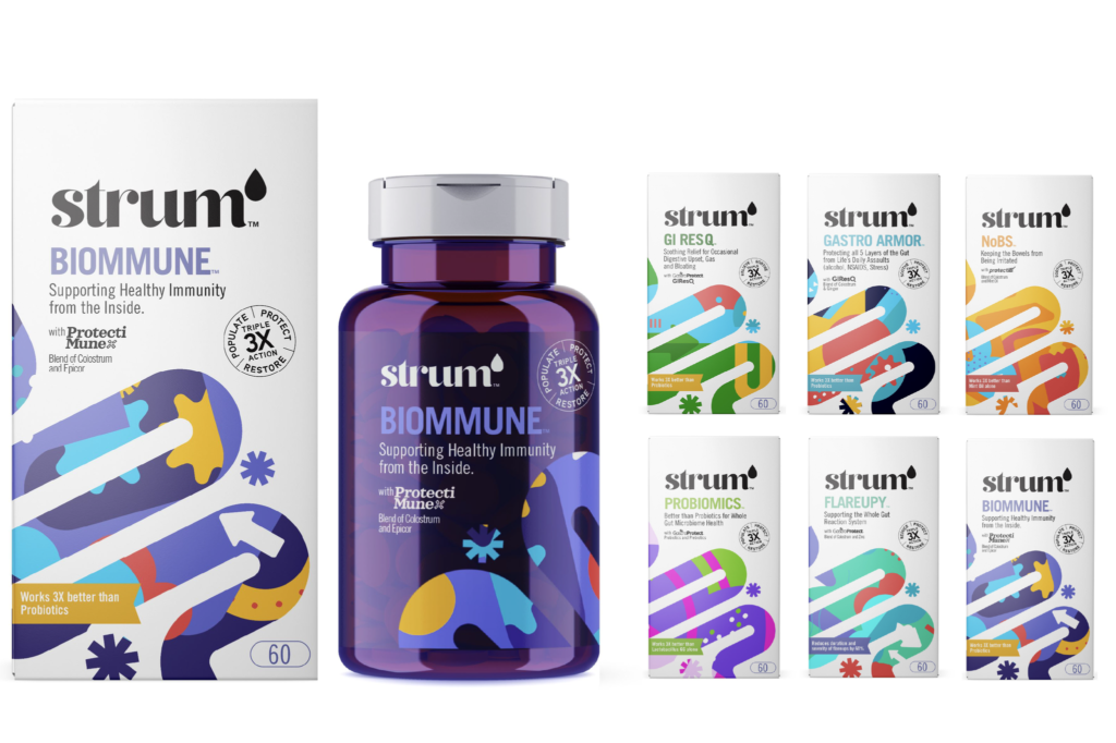
05. brand-world building
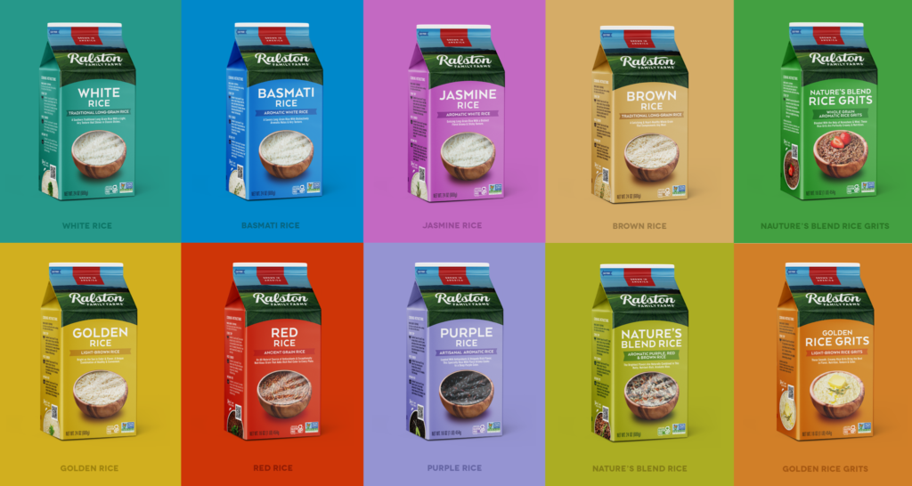
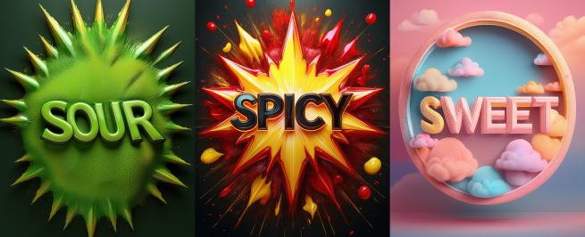
Color-coded product lines organized by function, flavor, or mood enable consumers to navigate offerings quickly and intuitively. This visual segmentation simplifies the shopping experience, allowing customers to identify the right product at a glance while reinforcing brand consistency and clarity across the range.