Foerstel partnered with Nutri-Rich to build out a brand architecture for three new adaptogenic multivitamin products. The client had a strong existing brand and design language, but was looking to branch out visually as a way to signal new products and create buzz with new customers.
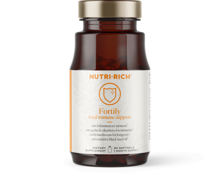
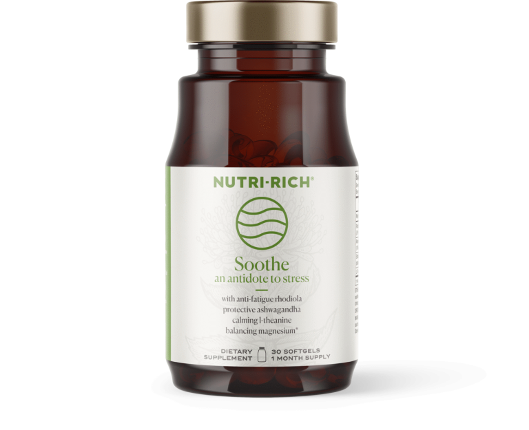
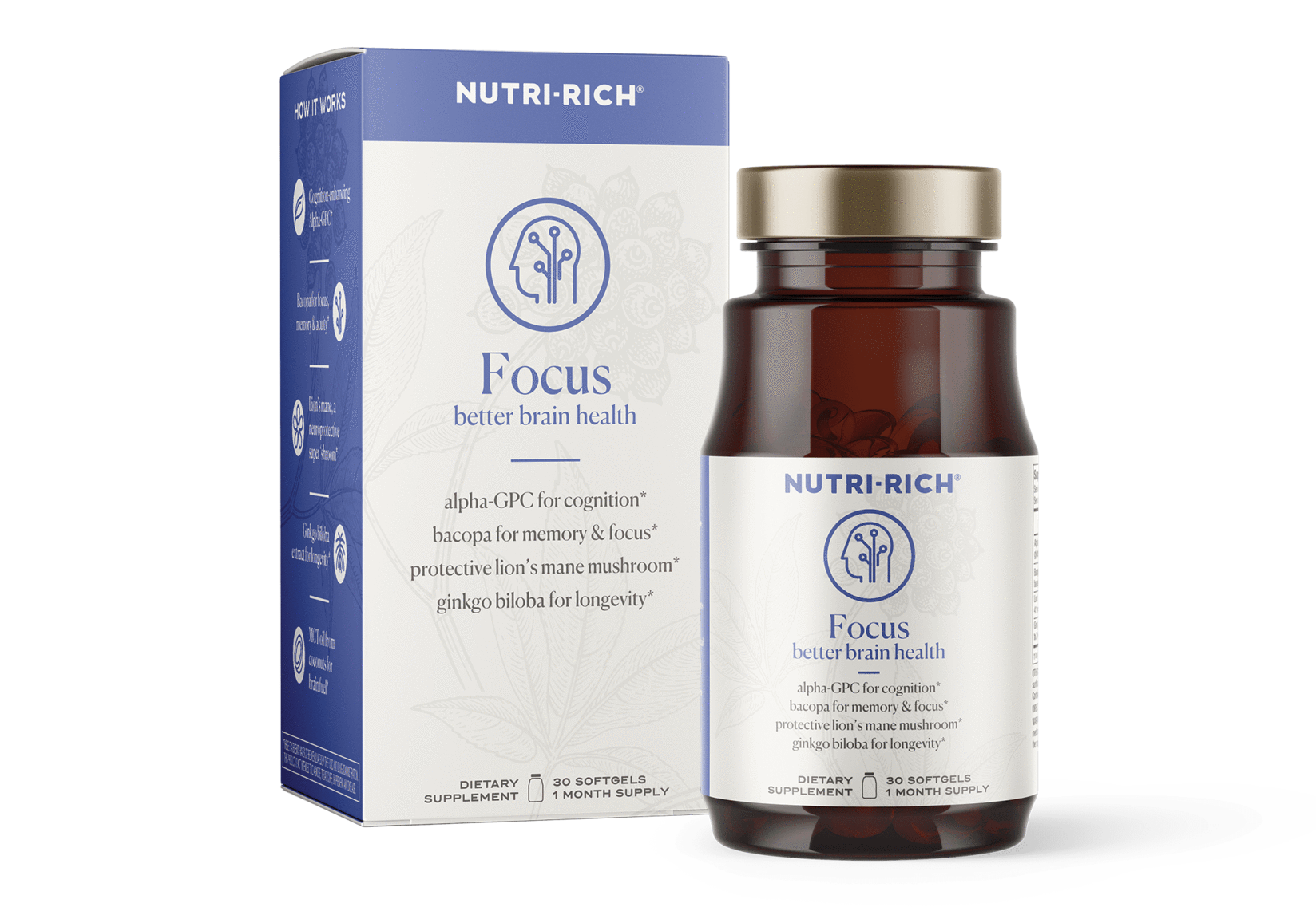
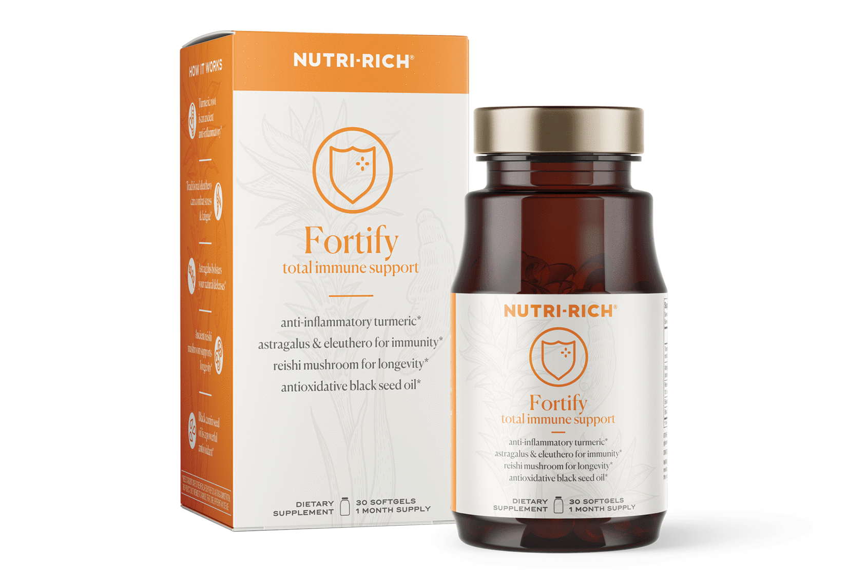
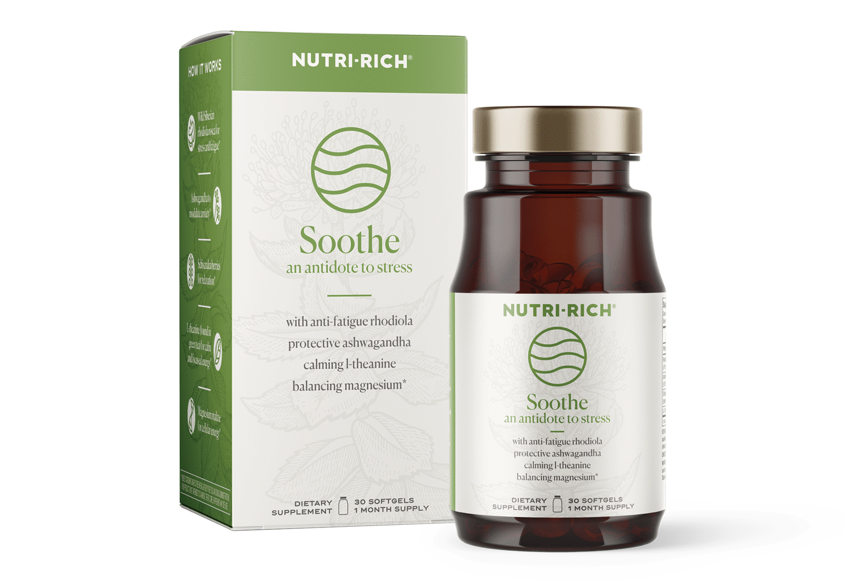
Packaging is our specialty, and we’re veterans in the supplement and bioceutical industries. After some careful research we jumped on concepting three bottles and accompanying boxes: A focus blend, a fortify blend, and a soothe blend.
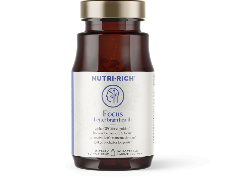
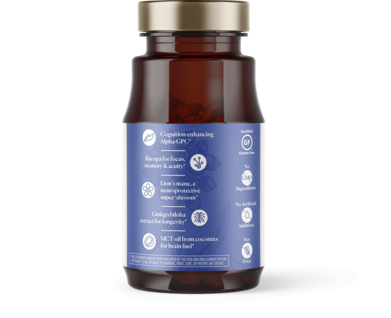
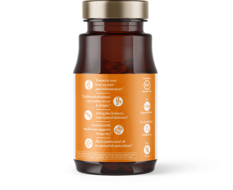
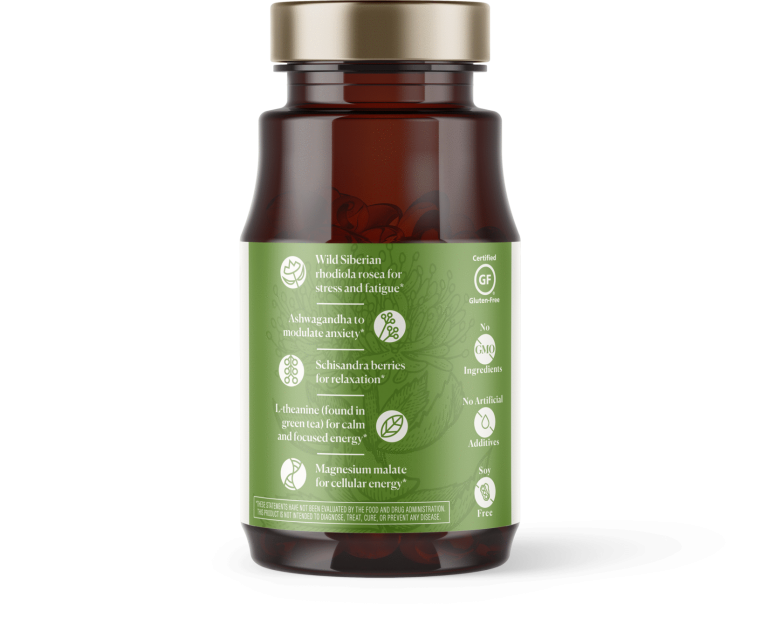
Nutri-Rich has made its mark in the vitamin market with their simple supplements made with honest and recognizable ingredients, and keep their sourcing completely transparent. We looked to these values in our design, utilizing clear iconography to pull the eye in and calling out the ingredients and their great benefits to the customer.
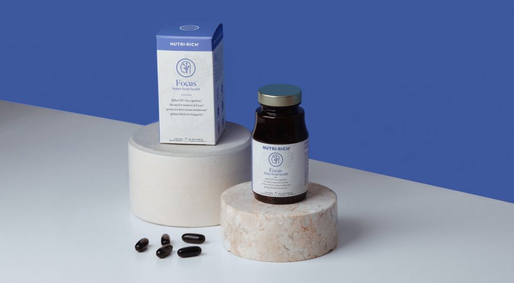
Early concepts gave Nutri-Rich a number of directions to take the product, and they found that our first iterations with eye-catching colors, soft cream fields, clear iconography, and striking but subtle background art panels spoke to them the most.
Below are the final bottles and their box packages. Check out the clear, eye-guiding iconography that gives you an immediate idea of how the supplement can help you. The typography is informative, but smartly broken up with colorful rules and open spacing. At first glance the background illustration is just a texture but stands as a statement of the brand’s values on its own.
How do you think we did? We’d love to hear your feedback as we are always using projects like this to bring us (and our clients) to the next level of design.

