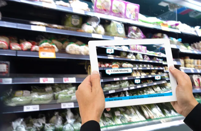
When every dollar’s doing double duty, your packaging design better work. Packaging that pulls its weight doesn’t just sit pretty; it grabs attention, tells a story fast, and nudges that hand toward the cart. Smart choices in layout, hierarchy, and emotional spark can boost your brand’s vibe and value without dropping extra cash on ads. That’s the beauty of intelligent design: it saves money, sells better, and still turns heads on shelf.
01. how strategic packaging boosts perceived value
Strategic packaging design is crucial in shaping how consumers perceive a product’s value, often influencing their willingness to pay a premium price. Research shows that well-designed packaging can enhance brand perception by signaling quality, trustworthiness, and uniqueness, which justify higher price points. Elements like elegant typography, tactile finishes, and thoughtful color choices create an emotional connection and suggest superior craftsmanship. Additionally, clear communication of benefits through visuals and iconography reduces buyer hesitation. When packaging tells a compelling story that resonates with target consumers, it elevates the entire product experience, making the price fair and worthwhile.
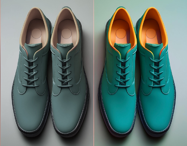
02. refreshing your cpg line without a full rebrand
Updating a packaging line doesn’t always require a complete overhaul. Minor, strategic tweaks can breathe new life into your products while maintaining brand recognition. Focus on refining key design elements like color palettes, typography, or packaging materials to modernize the look without losing your core identity. Introducing subtle changes to iconography or label layouts can improve clarity and shelf appeal. Incorporating current trends, such as sustainable packaging or minimalist design, can enhance consumer perception without a costly rebrand. By making thoughtful, targeted updates, you can keep your product line fresh and relevant, saving time and budget while re-engaging your audience.
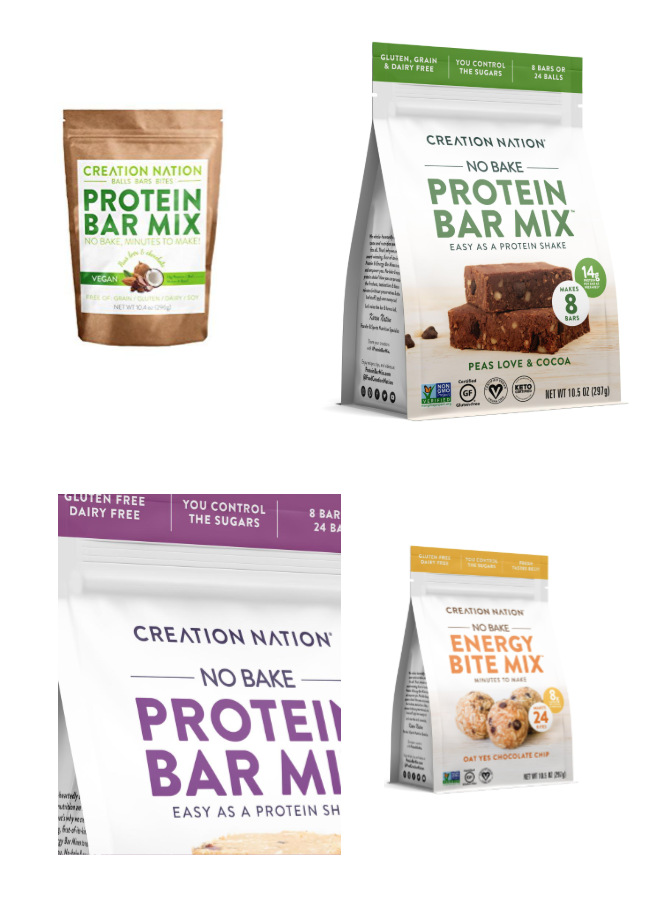
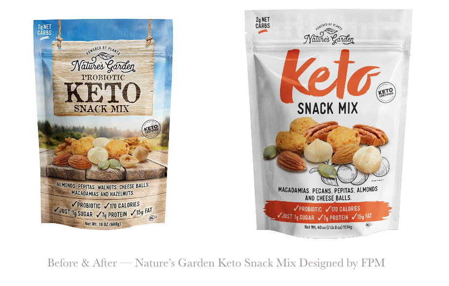
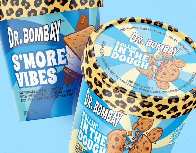
03. aaaand here is an example
Foerstel+Piper+Martin elevated Creation Nation’s packaging from a simple kraft pouch with a sticker to a more competitive, shelf-ready stand-up format. SKU-specific color bands allow for easy flavor navigation, while bold visuals—like rich, stackable protein bars—add crave-worthy appeal. Functional callouts are now more prominent, helping consumers instantly connect with product benefits like “No Bake,” “14g Protein,” and “Keto Certified.” The result is packaging that stands out in retail and aligns with Creation Nation’s bold, better-for-you promise.