Let’s talk about love at first sight—the kind that happens in the aisle.
Because whether shoppers realize it or not, they fall for packaging long before they read a label. And in CPG, that split-second emotional reaction is everything.
So… what makes a package irresistible?

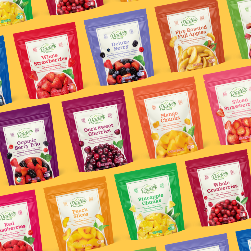
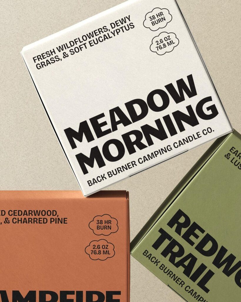
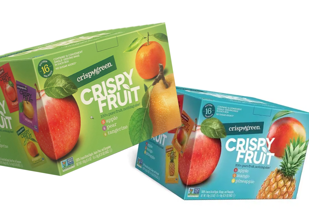
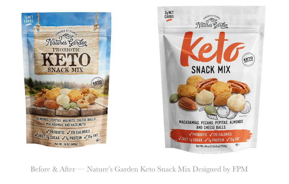
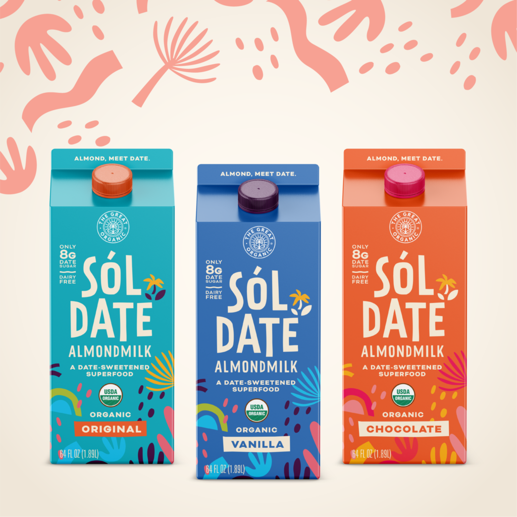
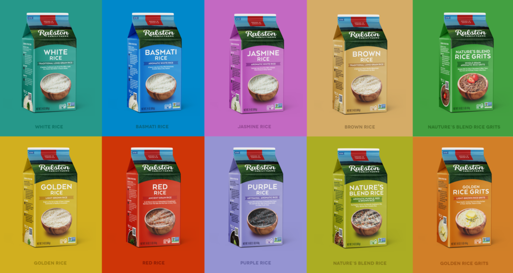
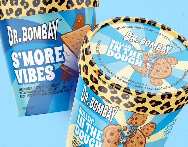
01. colors that trigger feelings
Color is the first thing shoppers notice. Before copy, before claims, before price. Reds and pinks scream passion, indulgence, and energy (hello, Valentine’s Day), while warm neutrals feel comforting, premium, and safe.
But beware, too much red can feel aggressive. Too much pink can feel juvenile. And warm neutrals without contrast? They disappear fast. Color only works when it matches the emotion your brand promises.
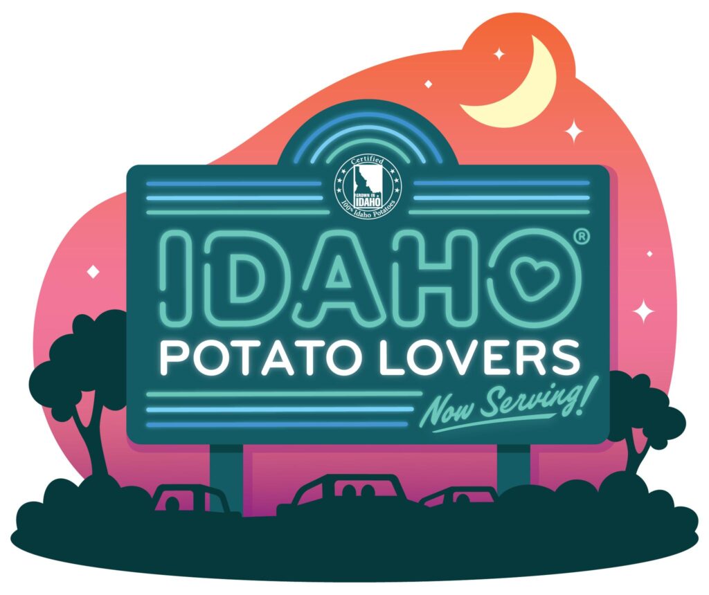
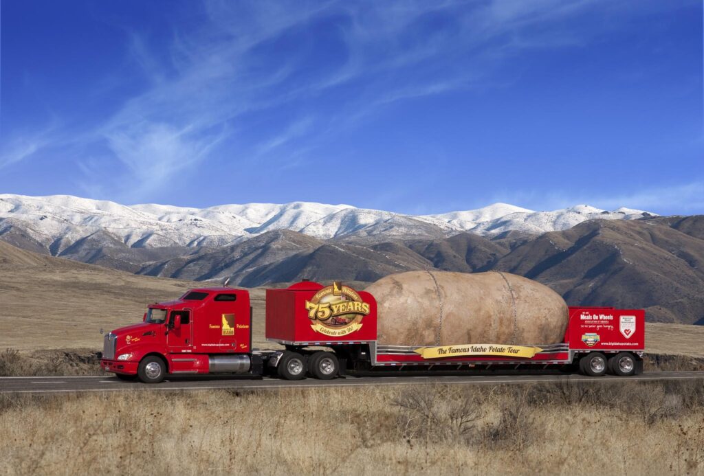
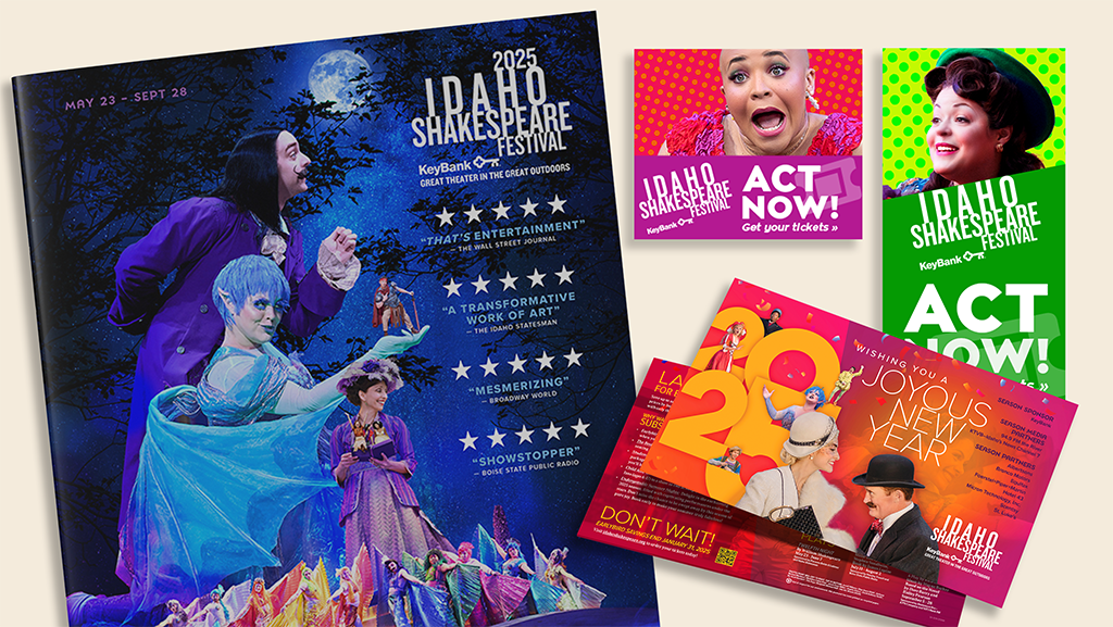
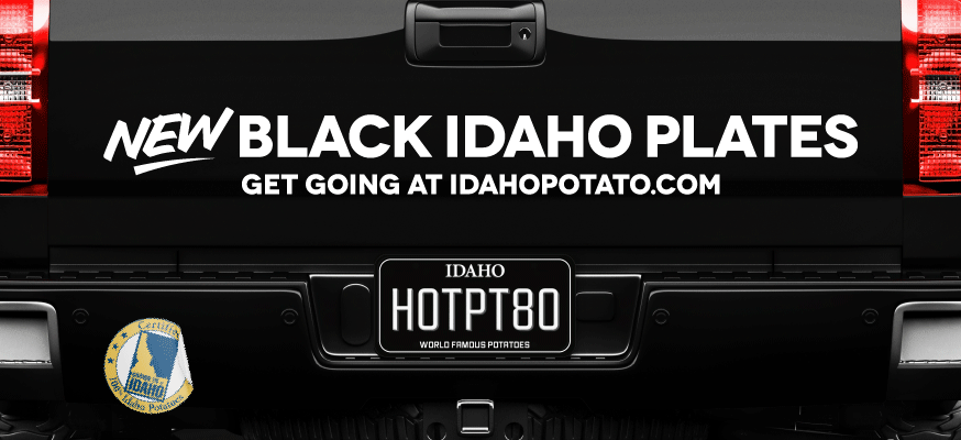
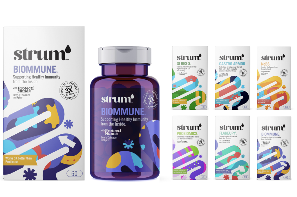
2025 Idaho® Potato Promotional Identity
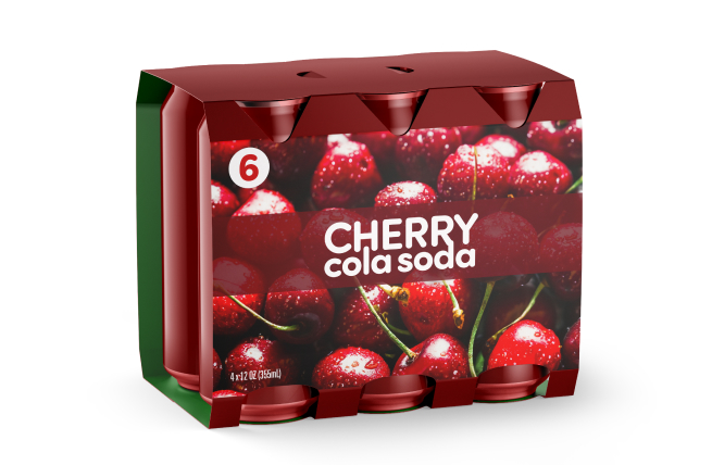
02. shape & structure that stands out
Unexpected silhouettes stop the scroll and the stroll down the aisle. Curves feel friendly and indulgent. Sharp edges feel bold and modern. Even subtle changes in height or proportion can signal “new,” “special,” or “worth a second look.”
03. typography that speaks your shopper’s love language
Soft scripts feel romantic and artisanal. Bold sans-serifs feel confident and modern. The magic happens when type aligns with who you’re wooing and doesn’t try to say everything at once.
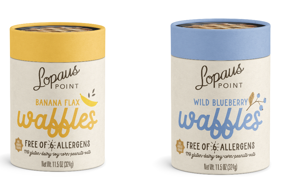
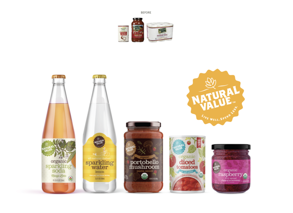
Lopaus Point Frozen Waffles Packaging
is your packaging lovable at first glance?
If not, we are here to make it swoon worthy. Contact our team of experts to update your packaging!