Drop shadows, textures, and bevelled edges are out, solid colors are in. The latest trend in graphic and web design is to undo all those fancy Photoshop effects we’ve been adding for years and return to a simpler aesthetic. This goes way beyond the interface changes we’ve seen in operating systems lately and is affecting every facet of design, from websites to logos. Today, we’ll see how eight major brands like MSN and Netflix have recently redesigned their logos to jump on the flat train.
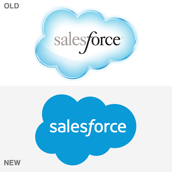
salesforce
Salesforce puts business intelligence in the cloud, and its logo used to be a softly rendered cloud with the company name emphasizing “force” by the stronger color of the text. The new version relies on the shape of the graphic to relay the cloud idea, using a uniform sans-serif font, except for the italic “f” that effectively highlights the word “force.”
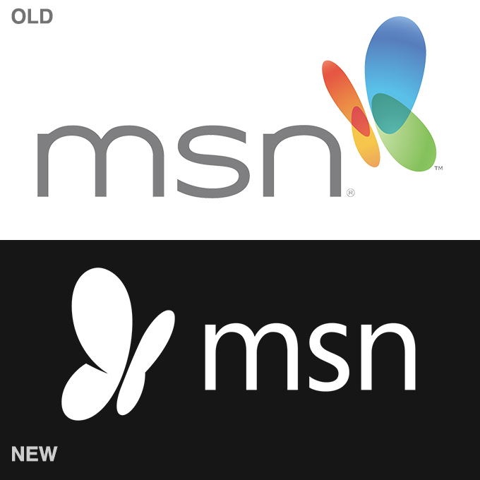
msn
MSN used to reference the four-color pane of Windows through the wings of an abstracted butterfly. The butterfly has been retained as a symbol of connectivity, but those colorful, overlapping, translucent wings have been clipped in favor of a flat, classy look that fits in with the greater Microsoft rebranding project.
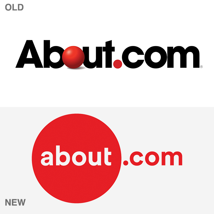
about.com
About.com used to depend on a 3D sphere that served as the “O” in “About”. Now the 3D look is gone, the ball has grown, and the color of the logo has been unified. The new version is certainly cleaner, and quite reminiscent of the AMC Theatres logo.
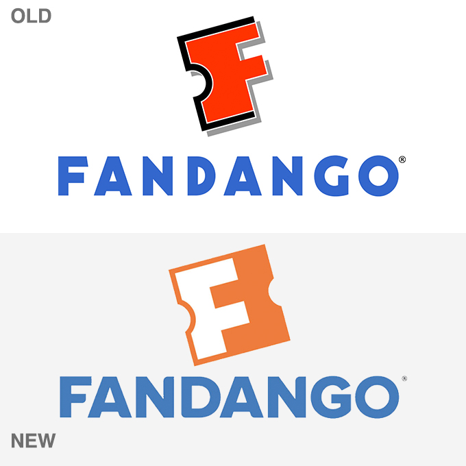
fandango
Fandango implements the suggestion of a ticket stub that doubles as an “F” for its graphic. The shadowed older version gives way to a subtler, flatter representation with its logo redesign. The new version is a welcome refresh. By comparison, the old logo seems quite ugly with too many outlines and shadows on the “F” and terrible kerning on the word “Fandango.”
peter piper pizza
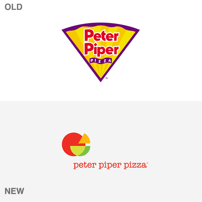
Peter Piper Pizza recently unveiled a possible new future for its brand. They’ve abandoned the pizza/paper fan banner in favor of a more abstract mark that incorporates both a slice of pizza and a salad bowl. According to WD, the agency behind the new branding, the update is an attempt to connect with Millennial parents (hence the salad bowl). Unfortunately, in doing so, they likely lose much of the “fun” factor that will appeal to their real target audience: your kids. Thus far, many outsider reviews of the new logo have been negative. The typewriter font is especially an area of contention. The current Peter Piper website maintains the old branding.
olive garden
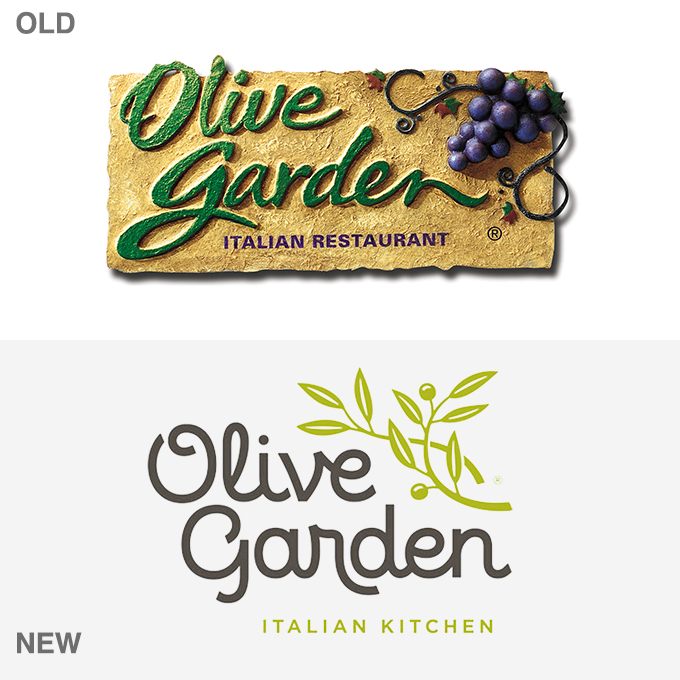
Olive Garden was definitely a brand with an old world aesthetic. It simply doesn’t get much more textured and gaudy than their previous logo. The new version is greatly simplified. Though it has been the target of countless design bashing sessions, it’s certainly more in line with current trends. I do like the use of olive shapes in the typography, and “Italian Kitchen” somehow does sound fresher than “Italian Restaurant.”
netflix
Netflix has dropped the shadowed lettering from its name, but retained the curve of the lower text line, reminiscent of old theater marquees. It’s one of the most subtle, yet transformative, re-works of any recent change in design, demonstrating how much can be done with minimal changes.
hershey’s
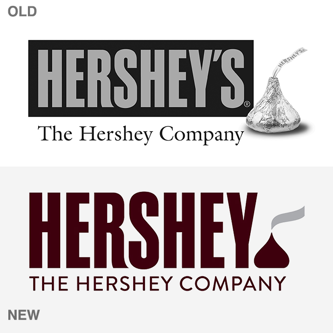
Hershey’s is one of the best-known brands around, so a logo redesign is a big deal. The update drops the apostrophe “s” and replaces the photo of a Hershey’s kiss with a simplified illustration. The tagline has been updated as well, dropping serifs in favor of a more modern look. It’s a simple enough rework that likely moves in the right direction, but it instantly got a bad rep on social media due to some hilarious but childish Photoshop tweaks.
[via creative market]

