

In the age of Adobe Illustrator, a sincere, hand-lettered sign or logo is a rare artifact of the past.
But as a student at Auckland University of Technology, designer Sara Marshall redrew 10 famous logos with paintbrushes, markers, and pilot pens. It wasn’t just some fantasy project in which she reimagined Subway and Burger King with flowers and filigree. She meticulously translated these rigid, well-known brands through careful calligraphy. And the results are like an uncanny peek into an alternate universe where computers and printers never came to be, and all branding must be drawn by hand.

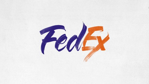
The logos are not all perfect, hand-lettered duplicates. Marshall’s FedEx logo looks like a spitting image to the real logo in my mind’s eye, until I load up the real thing and realize, of course, FedEx isn’t drawn in italics. The chasm is even greater with Subway. The real Subway logo is written in all-caps bold italic, with arrows leading in and out of the wordmark. Marshall’s mixes upper and lower case letters, and it ditches the arrows.

The remake is a much friendlier logo than Subway’s original. But unless you’re looking side-by-side, there’s a good chance you won’t even notice what’s missing. With the green extrusion, and the mix of white and yellow lettering, Subway still feels like Subway. Marshall’s greatest accomplishment is in picking up on just enough of the original brand essence to make the new versions feel familiar and right.
Despite a relatively positive Internet response to her work since it has been discovered on Behance, Marshall looks back on the project now and sees the imperfections. “It was a really fun project to work on, but something people don’t realize is the time pressure I was under while creating them—there were many sleepless nights and 16- to 20-hour working days,” Marshall says. “There were many changes I really wanted to make to the project as well, but it took off before I had a chance.”
Now, Marshall says she doesn’t have the time to redo any of the work. She’s too busy in her day job—as a professional letterer.


[via fast co. | design]