By Ted Mininni, President, Design Force, Inc.
Storytelling is one of the most-discussed marketing initiatives these days, and marketers are using every platform they can access to tell their brand stories. I would argue that no communication platform is more compelling than packaging because it is right at the point of sale where consumers are making decisions about which products to purchase.
The brand story is told on packaging via two kinds of language: verbal and visual. Of the two, visual cues can be the most compelling knowing that consumers, on average, spend precious few seconds scanning retail shelves. By using the right combination of package structure, color, imagery, iconography, background, fonts, and overall aesthetics, the story comes together in a way consumers can easily understand and digest.
The verbal brand communication on the front panel of packaging should support and augment the visual design elements in a simple, direct manner. Additional information, the brand history, or updated storylines can be easily shared on the back panel. Yet, every bit of real estate on packaging can be leveraged to tell the brand story, and it should be. This is important for the potential first-time consumer as well as for brand loyalists, who may take the time to learn more about the brand at the shelf or at home. Research consistently shows that in retail environments, consumers are more likely to purchase once they’ve picked up the package—hence the power of storytelling to begin or cement a relationship. Regardless of cultural backgrounds or the regions that they come from, consumers respond to the power of storytelling because it is deeply ingrained in human consciousness. Rather than appealing to the rational side of the decision-making process, it appeals to the emotions, which is far more powerful. The brand story, delivered in a simple, truthful, and transparent manner is connecting and memorable. If it is truly authentic, it begins to build trust. Every strong relationship is based on trust, and the brand-consumer relationship is no different.
the power of a good story
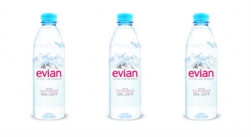
Heritage brands have often built their success over years, but that doesn’t mean their stories can’t be integrated in packaging in a more compelling manner. Sometimes refreshed packaging can bring their stories forward in a meaningful way. Evian bottled water just refreshed its packaging with a simple, new structure and signature blue cap. The clear bottle shows the purity of the product. Graphics depicting pristine Alpine mountains and the simple words, “Natural Spring Water” and “From the French Alps” are all that are needed. The packaging is crisp and clean, and isn’t that what Evian is all about?
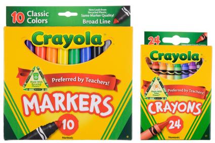
When consumers hone in on Crayola crayons, they see a cutout that shows a range of crayon colors within their boxes. This clever cutout has been broadened into a “smile” that promises fun for customers. Enjoyment, as we know, is a powerful purchase motivator. When nobody’s looking, we smile back! There’s nothing quite like intertwining consumers’ stories with that of a brand to further cement relationships.
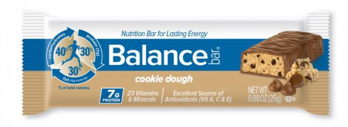
Balance Bar has a great story to tell athletes and active consumers, but it didn’t get the point across succinctly on its packaging until a recent refresh was undertaken. A terrific visual tells the Balance Bar story at a glance. An icon in the form of a circle and pie chart features a runner in its center. The perimeter of the circle is formed by arrows, and the pie chart is cut into three distinct areas that read: 40% carbohydrates, 30% fats (with 0 trans fats), and 30% protein—7 grams of it, in fact. On the bottom of the packaging, the copy “23 vitamins and minerals” and “Excellent source of antioxidants (vitamins A, C &E) appears. This, in a nutshell, is the Balance Bar story and where the whole concept of the “balance” needed to support active lifestyles is rooted.
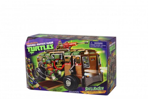
Kids’ toy brands have always used the power of storytelling and its natural appeal to children. Yet there is a plethora of toys in every category clamoring for attention. For example, there are countless action toys for boys, so how does Playmates Toys get the brand and story of Teenage Mutant Ninja Turtles across quickly and easily? Since Nickelodeon has given the four turtle heroes a rebirth with a new animation series, they’ve reemerged from the sewers to take on their foes and sample delicious new pizzas to the delight of original series fans and a whole new generation of kids. These mean, green crime-fighting brothers are leaner than they used to be. Even though they are updated, they still retain their classic attributes: their hallmark humor and grittiness.
The toy packaging tells the story at a glance, featuring the brand identity and characters in signature green on a purple backdrop. The colors are eye-popping and stand out on the retail shelf. High-action art on the front panel of the package captures the look and feel of the animated “heroes on the half shell,” armed with their signature Ninja weapons and masks. The blister has a turtle shell pattern running along the left side, and the right side features key art of the turtles as they appear in the animated series. Back panels feature character bios as well as artwork depicting the other toy characters that are available. Every device used on the packaging speaks to Teenage Mutant Ninja Turtles, their humor and grit, which is unique and like no other property.
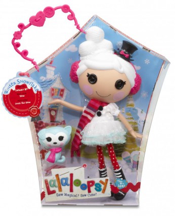
Similarly, there are many girls’ dolls on the market. Breaking in with a new brand is challenging, but it can be done in a highly successful manner. MGA Entertainment offers a great example with its Lalaloopsy brand of charming rag dolls known as Lalas. The characters are as unique as children are; each Lala comes to life from the fabrics from which she is sewn. Pillow Featherbed, for example, is made from a baby blanket, so she’s a sleepyhead and loves to read bedtime stories. Dot Starlight is made from the scraps of an astronaut’s space suit, so she loves science and outer space. Storybooks, games, and a dedicated website help fuel young girls’ imaginations about their favorite dolls. Programming on Nick Jr. launched in March 2013 is helping to further build the magic and aura of the brand.
But it’s the packaging that most deepens the brand experience. It brings the fantasy of the brand to life as well as the story of these sweet, button-eyed dolls and their friends for legions of adoring, preschool fans. The brand identity is a “fabric tag” that appears to be pinned onto the package. The Lalaloopsy brand name looks as though it is embroidered on the package, and the two “o’s” are buttons. Underneath, the words “Sew magical! Sew cute!” say it all. Each package features a slightly different structure and storybook background. So Crumbs Sugar Cookie, the adorable little baker’s package, turns into a bakery complete with baking implements. Little Bah Peep, the consummate actress, has a package that turns into her own stage. This is how package design is fully leveraged to capture the magic and ethereal story of the brand. Who can resist magic?
Plato once remarked, “Those who tell stories rule the world.” And that was well before the age of consumer product branding. I couldn’t agree more.
[via Packaging World]
