When designing a logo for your business, it’s important to take into account the way people interpret color. It’s the right time to ask, what kind of emotion do I want my brand to convey?
Using the Color Wheel in Logo Design
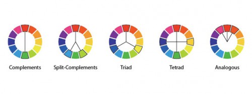
 The panels that have an outline above, with their linking lines, show the relationships colors have. For example, complementary colors are the colors directly opposite each other. In our illustration above (the first wheel highlights the relationship), red and green are directly opposite, so they’re complementary. Just as the blue on the left and the yellow on the right are complementary, the orange and light blue, and so on.
These aren’t the be-all and end-all of color combinations obviously, but they’re good places to start when choosing what colors you might want to use for a project. As you’ll see in the following examples, sometimes you might use three out of four tetrad colors, or go for an analogous harmony but stretch it out one more and skip one.
The wheel is our simple guide into the world of colors – something to use when you find yourself in a place of bother, or something you may choose to ignore. With that in mind, sometimes one may decide to ignore the wheel, but work with color meanings and psychology instead. It should be noted that it isn’t exactly a science. Ask a hundred people what red means and you’ll likely get dozens upon dozens of different answers – none wrong. But again, it’s a great starting point and gives you insight into how your audience may instinctively perceive something you’ve put together.
Logo Design | Color Meanings & Theory
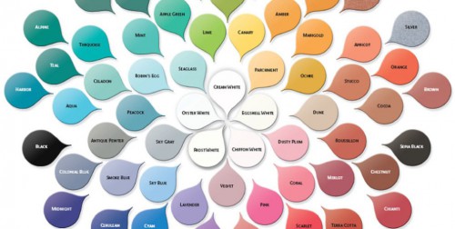
Color can make or break a design so it is vital that you know what colors mean and what they can communicate. Below are some ‘meanings’ of color. For example, McDonalds, Pizza Hut, KFC, Wendy’s and Popeyes use red in their logos to stimulate hunger. Black, white, silver and gold are often used in the logos of luxury brands like Chanel, Prada, Michael Kors and others to enhance the feeling of sophistication. Let this be a guide for the direction of your color palette. What four emotions do you wish to convey when someone thinks of your brand or sees your logo? Write these down and see where they fall in this color wheel of emotions. Remember, this is only one of many aspects of the logo design process to take into account.
Red evokes aggressiveness, passion, strength and vitality
Pink evokes femininity, innocence, softness and health.
Orange evokes fun, cheeriness and warm exuberance.
Yellow evokes positivity, sunshine and cowardice.
Green evokes tranquility, health and freshness.
Blue evokes authority, dignity, security and faithfulness.
Purple evokes sophistication, spirituality, costliness, royalty and mystery.
Brown evokes utility, earthiness, woodsy-ness and subtle richness.
Gray evokes somberness, authority, practicality and a corporate mentality.
Black evokes seriousness, distinctiveness, boldness and being classic.
Rules are Made to be Broken
Clearly, the rules that color harmony lays before us aren’t laws. At best, the are merely guides, to be followed if one chooses, but also ignored or used as nothing more than a starting point. The same can be said of the meanings behind colors. Different cultures see the symbolism of different colors through different eyes. Different, different, different. But this isn’t a bad thing by any means.
Red and blue were traditional colors for mailing, then FedEx came along. McDonalds set a standard in using red and yellow for the fast food industry. This is where the beautiful spark of creative thinking starts to ignite. Nothing is set in stone. It used to be that light blue was the color of girls, and pink the color of boys. Things change.
[via MediaNovak]
