luxury groceries

42200
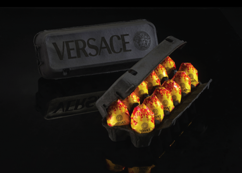
Israel-based (former) designer, Paddy Mergui has come up with an intriguing series that explores what it would be like if luxury brands packaged and sold everyday groceries. Titled ‘Wheat is Wheat is Wheat’, this exhibition “is meant to highlight the challenges a designer faces when tasked with promoting economic interests while remaining true to his or her own moral compass.”
Viewers will do a double take when they see a packet of yogurt with the trademark blue packaging of Tiffany & Co., while Versace’s eggs are covered in a sleek black case—through these juxtapositions, Mergui is exploring why the look of certain brands seem more highbrow to us, and the parts that designers have had to play in crafting a brand’s image.

“As designers we are constantly recruiting our worlds to create changes in product conception and values. The engagement in image and creating meaning is the heart of the visual communication field.” – Mergui

It is important to remember that Mergui is not criticizing these brands—he is criticizing consumers and the values that we have attributed to these luxury brands, urging us to re-examine our need to be associated with highbrow labels. Have a look at this playful series below—what do you think of it?
Mergui’s artworks will exhibited at The Museum of Craft and Design in San Francisco from now until June 15, 2014.

42201
"Yogurt," by Tiffany & Co. - created with the jeweler's iconic blue hue

42202
"Milk Powder" by Chanel

42203
"Rice" by HSBC

42204
"Flour" by Prada

42205
"Salami" by Louis Vuitton

42206
"Fruits" by Nike

"Eggs" by Versace

42208
"Corn-Flavored Ramen Noodles" by Burberry

42209
"Pickles" by Gucci

42210
"Pasta" by Ferrari

42211
"Milk" by Apple

42212
"Petit Beurre" by Dolce & Gabbana

42213
"Soft Butter" by Bvlgari

42214
"Salt and Pepper" by Hermès

[via design taxi]

Share this post

Book a Consultation
Tell us about yourself
Send Us A Message
Tom Foerstel : Founder & President

Tom Foerstel

Founder & President

Growing up in the San Francisco Bay Area in the 60’s, Tom developed a strong desire to create positive change for people and planet.


He went on to pursue his passion for art and design at Art Center College of Design in Pasadena, California, and worked for design firms in Southern California before moving to Boise, Idaho in the early 80’s. Foerstel Design opened its doors in 1985. Since its inception, the firm has cultivated a bold, happy, forward-looking team focussed on creating distinct and effective work on behalf of their clients.


An integral part of Tom’s philosophy is giving back to the community in which he lives — a company cornerstone that drives Foerstel’s long history of providing pro-bono services to local non-profit humanitarian and arts programs.


One of Tom’s proudest personal achievements is his ability to say Supercalifragilisticexpyalidocious backwards.