foerstel + piper + martin

minimal to the max

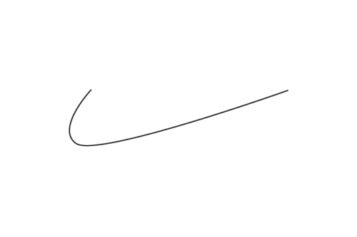
ultra-minimalist-logo-nikeAs design trends change, so do various experiments with famous brand logos pop up. For instance, when Microsoft unveiled its flat redesign (and maybe started a design revolution as well) a fun set of “Microsofted” logos of famous brands showed us how would it look if everyone embraced the same style. Now, with iOS7 and it’s wonderfully minimalistic design – and the similar design style rapidly spreading – here’s a set of ultra minimalistic famous brand logos, as another variation on the theme.
With nothing but lines and brand colors, StockLogos experimented with the new design trend and asked what would happen if everything went completely minimal. Take a look below; the logos are fun, and mostly maintain their recognizability even though reduced to sheer curves.


[via StockLogos]

Exit mobile version