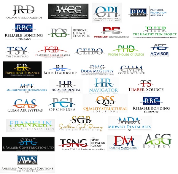
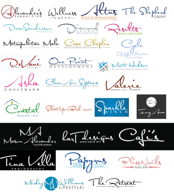
Graphic designer Giovanni Tondini has compiled an entire series of generic and overused logo designs that designers should refrain from using.
He stated that these cookie-cutter designs not only run the risk of not being able to get trademarked, they defeat the purpose of having a logo—to stand out from the others. Check out the rest of the run-of-the-mill logo designs here.
The company’s acronym cut in two colors by an arc (usually ‘Trajan’ font)
Use of the font ‘Satisfaction
Roofs and cubic buildings

Linked bubbles or dots.
 Shapes with swoosh lines through them.
[via design taxi]


