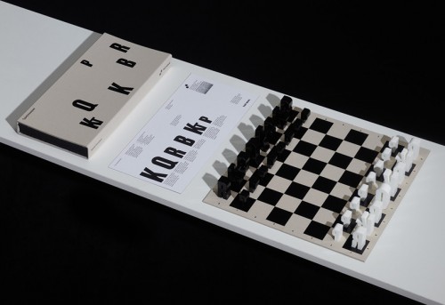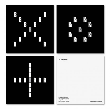
hat-trick have designed a typographic chess set based on chess notation, K for king etc. The forms are based on the typeface champion (lightweight) by hoefler frere jones. This unique twist on typography and chess was an arduous process that started over 5 years ago. Jim Sutherland of hat trick described the process as “a really tricky production in order to get the fine detail and the counters sharp etc, plus making sure everything stood up properly for example the Q and P had to be redrawn for stability and the ‘Kt’ ligature for knight was redrawn.”


Tom Foerstel
Founder & President
Growing up in the San Francisco Bay Area in the 60’s, Tom developed a strong desire to create positive change for people and planet.
He went on to pursue his passion for art and design at Art Center College of Design in Pasadena, California, and worked for design firms in Southern California before moving to Boise, Idaho in the early 80’s. Foerstel Design opened its doors in 1985. Since its inception, the firm has cultivated a bold, happy, forward-looking team focussed on creating distinct and effective work on behalf of their clients.
An integral part of Tom’s philosophy is giving back to the community in which he lives — a company cornerstone that drives Foerstel’s long history of providing pro-bono services to local non-profit humanitarian and arts programs.
One of Tom’s proudest personal achievements is his ability to say Supercalifragilisticexpyalidocious backwards.