One of the major traps, when talking about type, is mixing up fonts with typefaces or treating them as synonymous. Many a typographic expert has haughtily corrected a beginner for mistakenly using the word font when he or she should have said typeface. To those of us who think about fonts only when choosing one in Microsoft Word, the distinction between the terms can seem confusing, esoteric, and even arcane.
In brief: A font is what you use, a typeface is what you see.
font vs. typeface
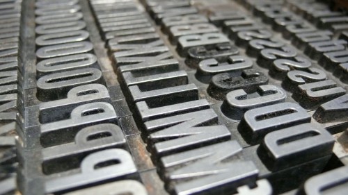
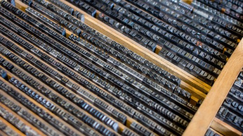
Back in the good old days of analog printing, every page was laboriously set out in frames with metal letters. That was rolled in ink, and then it was pressed down onto a clean piece of paper. That was a page layout. Printers needed thousands of physical metal blocks, each with the character it was meant to represent set out in relief (the type face). If you wanted to print Garamond, for example, you needed different blocks for every different size (10 point, 12 point, 14 point, and so on) and weight (bold, light, medium).

This is where we get the terms typeface and font. In the example above, Garamond would be the typeface: It described all of the thousands of metal blocks a printer might have on hand and which had been designed with the same basic design principles. But a font was something else entirely. A font described a subset of blocks in that very typeface–but each font embodied a particular size and weight. For example, bolded Garamond in 12 point was considered a different font than normal Garamond in 8 point, and italicized Times New Roman at 24 point would be considered a different font than italicized Times New Roman at 28 point.
The distinction between the two terms, and the processes they encapsulated, got muddied with the rise of desktop publishing. Fonts were no longer thousands of tiny blocks of movable type; they became digital computer files that scaled themselves up or down dynamically to whatever size or weight users wanted. So the distinction between process and end result disappeared in a puff of binary magic for most people.
Open up Microsoft Word and you’re asked to choose a font, not a typeface. From the perspective of Microsoft’s designers, this makes perfect sense. At any given time, after all, you’re working in a specific size and weight of a typeface. This is the proper term. But from the perspective of millions of computer users who have never given a thought to type–outside of deciding what they want to use for their email signature or homemade birthday card–the word font has come to represent the look, not the mechanism.
does it even matter anymore?
Even among type professionals, there’s a growing acceptance that for most people, the terms font and typeface can be used interchangeably. Only experts really need to worry about it.
“For most people in most situations, those terms can swap around without any trouble,” Tobias Frere-Jones tells Co.Design. “The distinction would matter in type design, obviously, but also contexts which involve engineering, like app development or web design.”
Gary Hustwit, director of Helvetica, agrees. “Most people other than type designers just say ‘font,'” Hustwit says. “Among graphic designers, though, I’d say it’s a generational thing. A lot of the older designers I’ve met, like Massimo Vignelli, always say ‘typeface.'”
And Pentagram’s Eddie Opara puts it even more succinctly: “I think it’s the latter, a distinction for experts,” he says. “I know it certainly pisses experts off.”
in a nutshell
Even type experts agree: Typeface and font can be used interchangeably at this point. But if you come across an annoying pedant who cares deeply about maintaining the distinction for the masses, just remember this: The difference between a font and a typeface is the same as that between songs and an album. The former makes up the latter. Remember that and you’re good to go.
