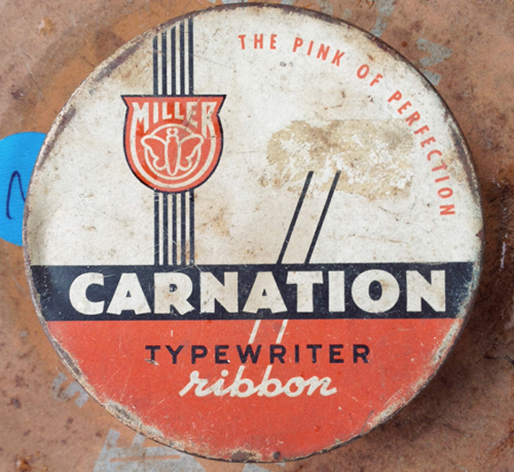
Typefaces, also known as font families like Arial and Garamond, could be the most under-appreciated but powerful art form in existence. Typeface design influences nearly everything we Americans do—from the books we read, to the products we buy, to the food we eat, to the TV we watch, to the (ahem) blog post you’re scanning (thank you for scanning).
Where would Apple Computer be, for example, without its mythical Myriad typeface, the one that helped convince America of the iPhone’s holiness? The typeface is a powerful thing. A question to ponder, then, is how the evolution of older typefaces reflects changes in our popular and consumer culture(s).
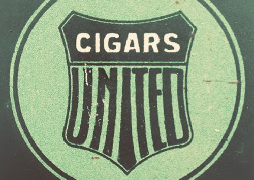
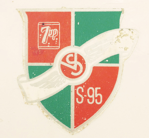
Or, you could just enjoy these stylish, antique typefaces and reminisce about the imaginative country that created them. Your choice.
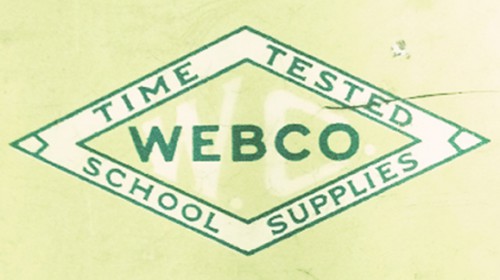
Yesterday, the crayons came in a tin box. A tin box of no more than seven to eight crayons. The typeface was squatty, round, and playful, kind of like schoolchildren.
Today, the crayons that aren’t digital come in a waxy, cardboard container and there are 512 colors. Shoot, when we was children, we walked to school uphill, both ways, in the snow, barefoot, chased by a pack of wild dogs while carrying a sackful of bricks. And on a good day, we had three crayon colors: red, yellow, and blue.
Green, if was a really good day. (Or if it was St. Patrick’s day).
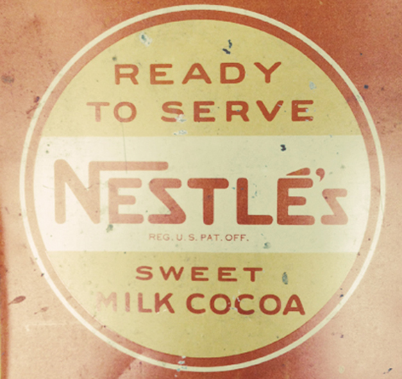
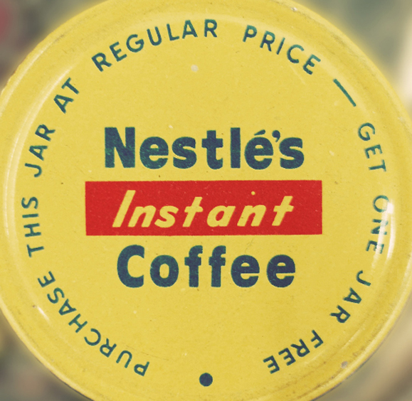
Now, here’s a powerful typeface at work. Look at that “N” in Nestlé, nestling the “e” and the “s” like the outstretched arm of a long-lost friend near a warm campfire, drinking hot cocoa, probably.
This is how Nestle took over all the chocolate in your life. This typeface. (And Nestlé’s Crunch bars).
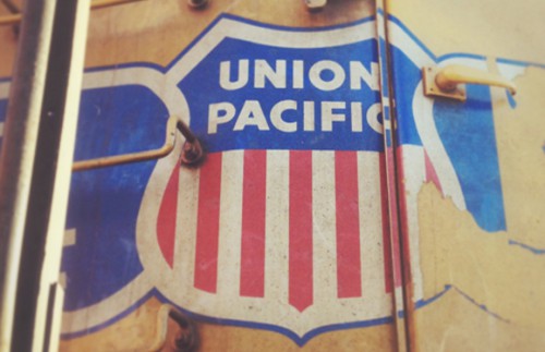
Yet some old typefaces don’t need any changing at all.
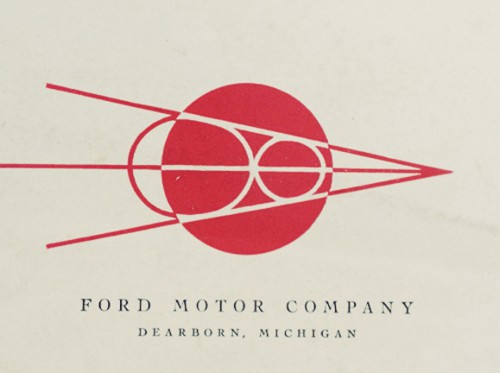
Ditto, Dearborn.
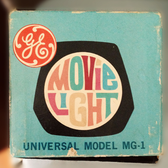
And some typefaces let you know precisely the era from which they came. This Magic Movie Light (what does that even mean?) is without a doubt from the late 60’s or early 70’s. You don’t even need Google to know that.
Those letters did so much acid back in the day.
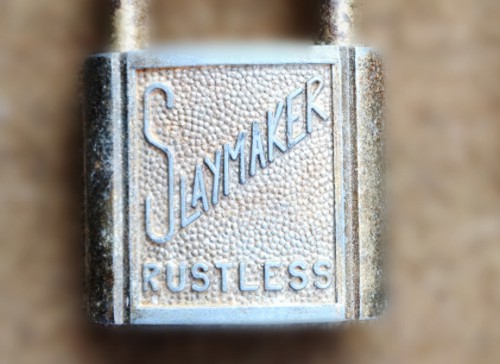
And still, more obscure typefaces raise new questions. Is Slaymaker a family name or a profession? And if so, what exactly is a Slaymaker? One who makes slay, presumably.
What could that possibly refer to, other than a professional assassin?
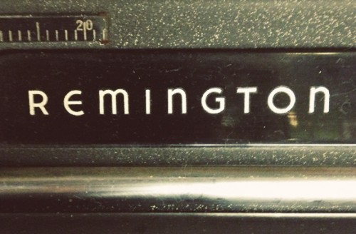
Finally, the typeface that adorned more famous American authors’ typewriters than any other.
Ironic, because those m’s and n’s are clearly lower-case, which effectively confuses the font and makes capitalization pointless, which is basically a writer’s worst nightmare.
[via Huckberry | photos Type Hunting]
