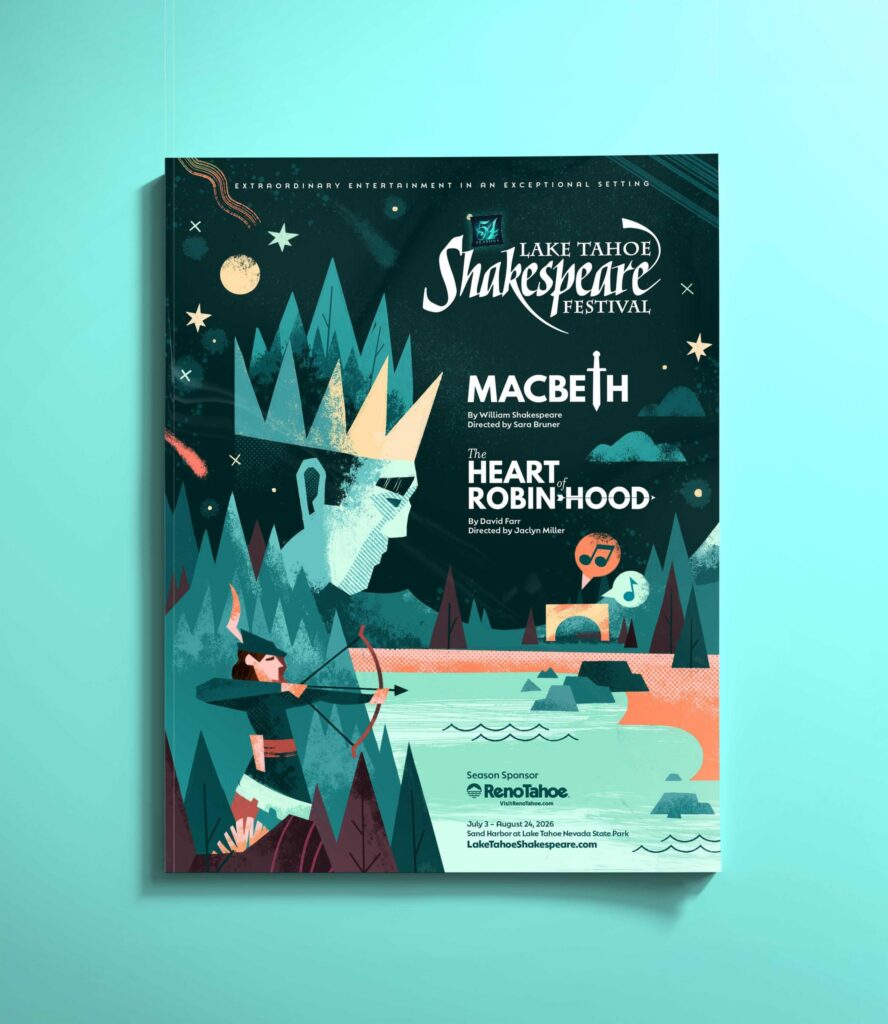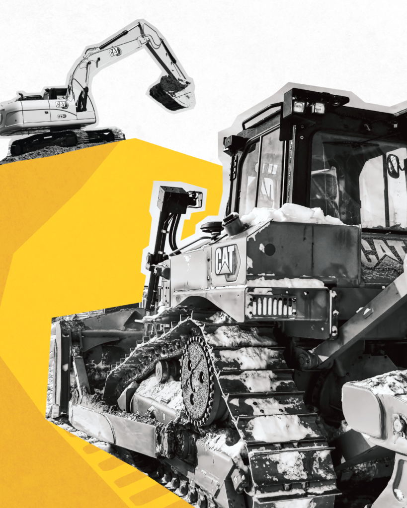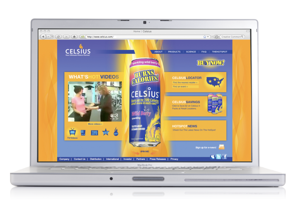

Design is everywhere.
It shapes the environments we move through, the information we encounter, and the countless small decisions we make each day. It’s in the street signs we pass each morning, the parking ticket beneath a windshield wiper, the instruction label we overlook until we need it, and the deceptively complicated sign directing us to the right door.
Much of this design is utilitarian. It exists to communicate, instruct, organize, or solve a problem. But utility and delight aren’t mutually exclusive.
At FPM, we’re interested in what happens when design goes a step further—when it not only makes information clearer and experiences easier, but also brings a sense of intention, character, and curiosity to the everyday.
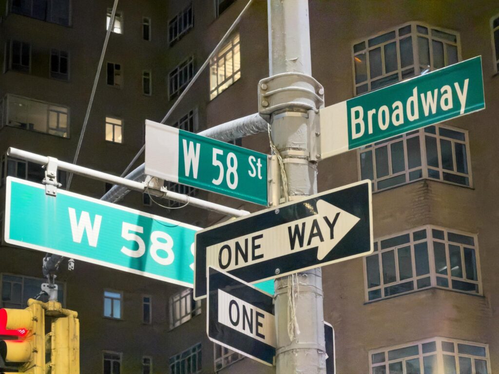
01. the signs we all pretend to read
Street signs, parking instructions, Building directories, trail markers, temporary construction signs, the laminated piece of paper taped to a door.
These are all opportunities for design to make life a little easier.
Good information design helps people understand what they need to know quickly. That means creating hierarchy, simplifying the message, choosing the right type, and making sure the most important thing is actually the first thing you notice. Sometimes unnecessary “creativity” is, well… unnecessary in this kind of information design. Legibility is the priority.

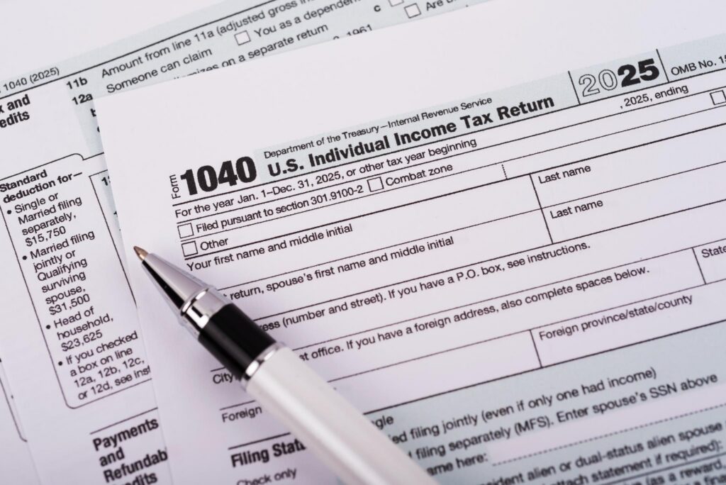
02. forms, instructions & other necessary evils
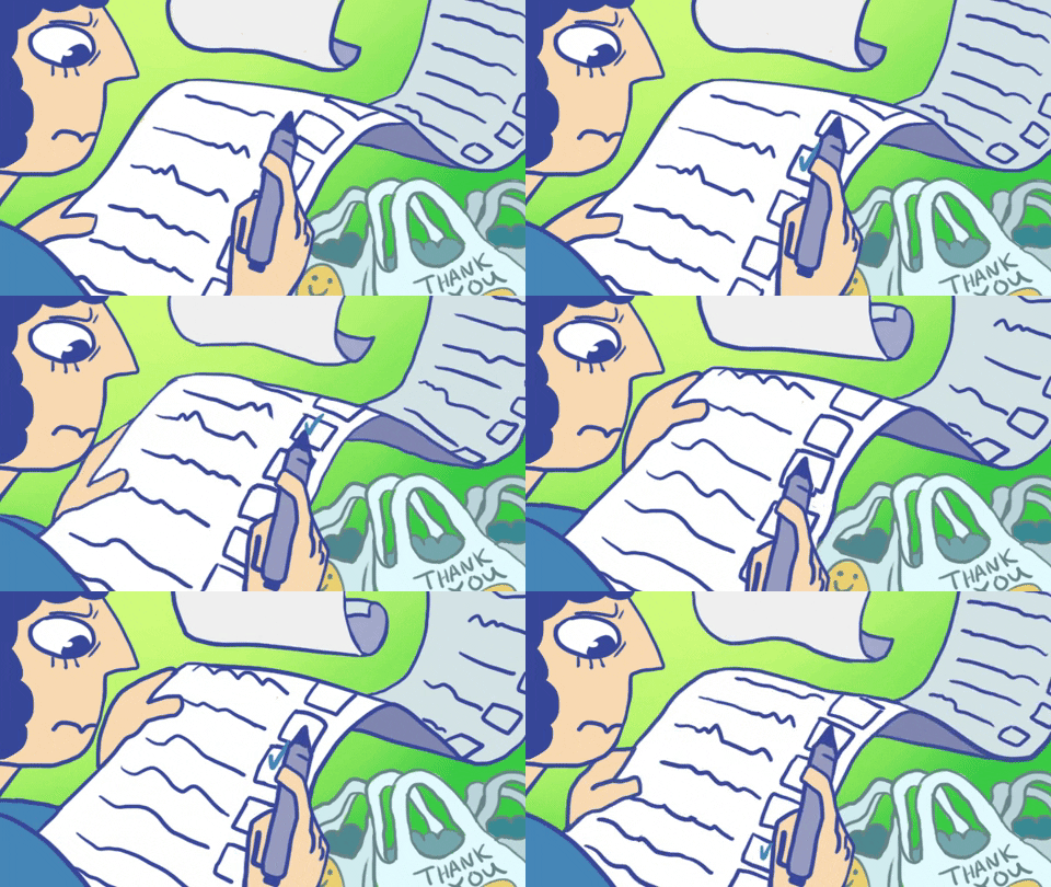
Forms, instructions, menus, maps, schedules, guides—anything dense with information presents an opportunity to design more thoughtfully. When the content is complex, the solution isn’t always more explanation.
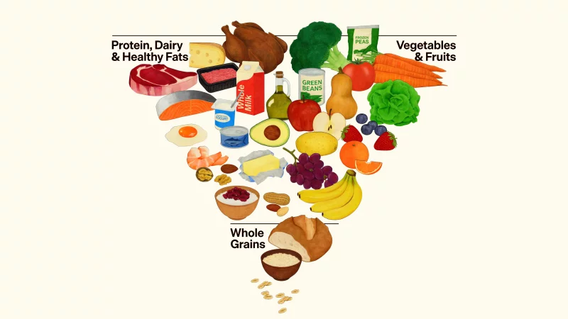
Often, it’s a clearer visual system: a well-structured hierarchy, a considered sequence, or a simple infographic that communicates in seconds what paragraphs of copy struggle to convey. The goal isn’t to remove information. It’s to make information easier to navigate, understand, and act on.
03. we notice these things for a reason
Once you work in design, it becomes difficult to see the world quite the same way.
We notice the kerning on a street sign. We wonder why one button is six times larger than another. We question the typeface, the hierarchy, the choice of color—and, occasionally, who approved any of it. More often than not, we find ourselves mentally redesigning something before we’ve even finished looking at it.
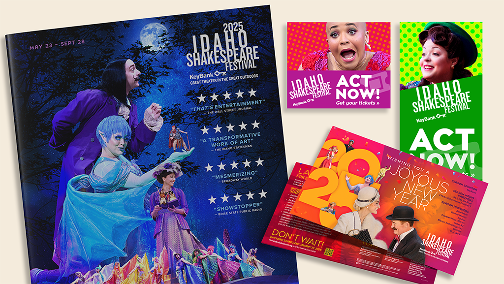
But that heightened awareness is also what we bring to every FPM project. Curiosity is part of the process. So is paying attention to the details others might overlook and asking whether something could communicate more clearly, function more intuitively, or leave a stronger impression.
have something that could use a redesign?
Maybe it’s not a street sign, but maybe it’s your brand. We’d love to take a look!
Let’s make the everyday a little better.
until next time,